Card
Cards help group visual elements on a page, or act as interactive tiles.
Usage
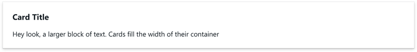
The card acts as a wrapper around child renderables, and will expand to fit the width of its container.
Use any component(s) as children.
import { Card } from '@blueprintjs/core' <Card > <h3 >The title</h3 > <p >Content goes here</p ></Card >Drop Shadow
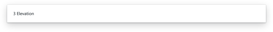
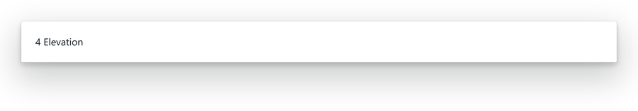
Draw attention to the card by 'elevating' it from the page. Control the drop shadow by configuring the elevation property with an input integer between 0 and 4.
Elevation of 0 (default) does not apply drop-shadow.


<Card elevation ={2}> <h3 >The title</h3 > <p >Content goes here</p ></Card >Interactive
Card's can increase elevation when interacted with (mouse-over).
While hovering over an interactive card, the user's cursor will change icon to suit a clickable context.
<Card interactive elevation ={3}> <Composition templateCols ="1fr 1fr"> <Box > A </Box > <Box > B </Box > </Composition ></Card >