ChartAnnotation
Annotations draw lines and rich content on the graph, useful for indicating a value or event of interest on a LineChart.
Usage
Annotations are available with different variants, but all have a similar API surface. They accept DataSource or Accessor guided control over their position, or manually set x or y values, as well as styling related properties.
A ChartContainer can render an unbounded number of annotations. Each annotation only displays one point of data.
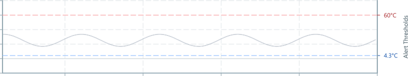
import { ChartContainer , LineChart , RealTimeDomain , TimeAxis , VerticalAxis , HorizontalLineAnnotation } from '@electricui/components-desktop-charts'import { useMessageDataSource } from '@electricui/core-timeseries' const OverviewPage = () => { const tempDS = useMessageDataSource ('temp_ptc') const maxTempDS = useMessageDataSource ('temp_max') return ( <React .Fragment > <ChartContainer > <LineChart dataSource ={tempDS } /> <TimeAxis /> <VerticalAxis /> <RealTimeDomain window ={10000} /> <HorizontalLineAnnotation dataSource ={maxTempDS } /> <HorizontalLineAnnotation y ={50} /> </ChartContainer > </React .Fragment > )}HorizontalLineAnnotation can help callout minimum or maximum values, or provide threshold indicators.
VerticalLineAnnotation are useful for indicating a statechange or event which has importance in time-domain.
PointAnnotation are useful for highlighting single points of information.
ElementAnnotation allows for rich markup with text, shapes and colours for painting information at a specific location in a LineChart.
Annotations render as ordered in the source code; the last annotation component renders last and will be above other lines.
Datasource input
The default accessors of the HorizontalLineAnnotation and VerticalLineAnnotation take the data of the event as their y or x position, respectively.
The default accessor of the ElementAnnotation assumes the data of the event is an object with keys x and y.
A null can be passed as the data to hide the annotation.
Color
Use the color property to style the line.
Use a hex value #0066cc via string, or use enum driven color for consistency with other UI components.
import { Colors } from '@blueprintjs/core' <HorizontalLineAnnotation color ={Colors .BLUE3 } /><HorizontalLineAnnotation color ="#0066cc" />Line Width
The thickness of the line in pixels is developer configurable by setting lineWidth to any positive number.
The default is 2.
<HorizontalLineAnnotation lineWidth ={1} /><HorizontalLineAnnotation lineWidth ={4} />Horizontal Annotation
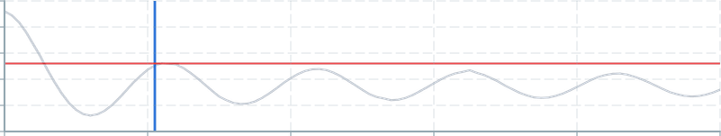
A HorizontalLineAnnotation draws a straight line configurable in the y axis.
import { HorizontalLineAnnotation } from '@electricui/components-desktop-charts' <HorizontalLineAnnotation dataSource ={powerMaxDataSource } color ={Colors .ORANGE3 }/>Manually specify the position with the y property.
<HorizontalLineAnnotation y ={230} color ={Colors .ORANGE3 } />Vertical Annotation

A VerticalLineAnnotation draws a straight line, configurable in the x axis (time).
This typically requires a custom DataFlow to identify/filter a message and emit the relevant time.
In this example, the highSpeedSource emits events at certain times, and the accessor on the VerticalLineAnnotation draws its line at the time of the latest event. The default accessor places the line at the time of the event, instead of the data.
import { VerticalLineAnnotation } from '@electricui/components-desktop-charts' <VerticalLineAnnotation dataSource ={highSpeedSource } accessor ={(data , time ) => time } color ={Colors .RED3 }/>Manually specify the position with the x property.
<VerticalLineAnnotation x ={1200} color ={Colors .ORANGE3 } />Y Axis Annotation
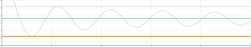
A YAxisAnnotation provides side-lined annotations which track a datasource.
This can display the numeric value of a signal alongside the plot, or callout specific values by using a custom message processor to identify/filter a message and emit specific events to the datasource.
import { YAxisAnnotation } from '@electricui/components-desktop-charts' <YAxisAnnotation dataSource ={signalSource } />Styling control over the annotation and the dashed gridline is also exposed. Labels and tick formattting properties are also exposed.
<YAxisAnnotation dataSource ={temperature_thresholds } accessor ={event => event .minimum } color ={Colors .BLUE2 } gridColor ={Colors .BLUE5 } tickFormat ={(tick : number) => tick .toFixed (2) + '°C'}/> <YAxisAnnotation dataSource ={temperature_thresholds } accessor ={event => event .maximum } color ={Colors .RED2 } gridColor ={Colors .RED5 } tickFormat ={(tick : number) => tick .toFixed (0) + '°C'}/>Point Annotation
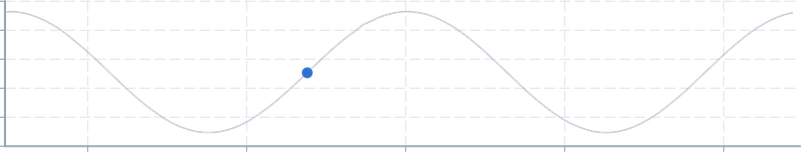
A 2D 'dot' which can be positioned with typical DataSource and accessor syntax. Internally, this uses the same functionality as ScatterPlot.
The accessor must return an object of the form {x: number, y: number} to specify the position on the chart for the annotation, or a null to specify that the annotation should hide.
import { PointAnnotation } from '@electricui/components-desktop-charts' <PointAnnotation dataSource ={dataSource } accessor ={(data , time ) => ({x : time , y : data })} color ={Colors .BLUE3 }/>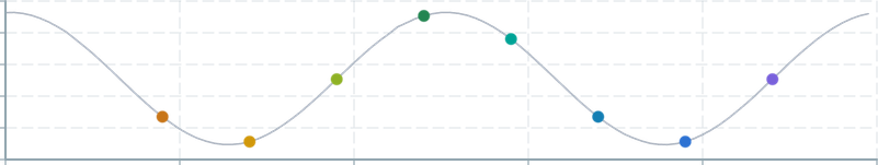
The colour can be specified as a string or number.
<PointAnnotation color ={Colors .BLUE3 } /><PointAnnotation color ="blue" /><PointAnnotation color ="#0066CC" />As with other charts and annotations, colorAccessor is available for dynamic control. This example uses a Three color and changes based on the underlying data.
import { Color } from 'three' const col = new Color ()<PointAnnotation dataSource ={dataSource } color ="#FFF" colorAccessor ={(data , time ) => { col .setHSL (0.4, 0.6, 0.5) if (data < 500 ) { col .setHSL (0.0, 0.5, 0.5) } return col .getHex () }} />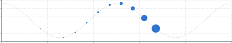
Size is controllable by providing a number to the size property. Use the sizeAccessor to dynamically control the annotation's size.
<PointAnnotation size ={1} /><PointAnnotation size ={8} /><PointAnnotation size ={32} />Element Annotation
A ElementAnnotation passes a developer specified component into the ChartContainer context and moves it to stay aligned to a point on the Chart.
ElementAnnotationdoes not acceptcolororlineWidthproperties; the child content must handle styling.
Dynamic positioning relies on a DataSource with the same syntax as a normal LineChart. Manual positions control properties x and y are available.
The accessor must return an object of the form {x: number, y: number} to specify the position on the chart for the annotation, or a null to specify that the annotation should hide.
import { ElementAnnotation } from '@electricui/components-desktop-charts' // Select the x value to be the event timestamp<ElementAnnotation dataSource ={annotationDS } accessor ={(data , time ) => ({x : time , y : data })}> <span >Useful notes?</span ></ElementAnnotation >If the annotation has both a manually set position and an accessor and dataSource, the annotation will start at the manually set position and move when an event is received.
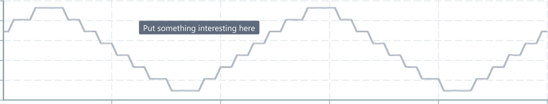
<ChartContainer > <ElementAnnotation dataSource ={annotationDS } accessor ={(data , time ) => ({x : time , y : data })} x ={100} y ={800} > <div style ={{ textAlign : 'left', color : 'black', width : '150px', }} > Put something interesting here </div > </ElementAnnotation ></ChartContainer >Any valid components are embeddable, though we recommend restricting these to display/output focussed components.
<ElementAnnotation > <Tag minimal intent ={Intent .WARNING } icon ="warning-sign"> Oscillation Detected: <Printer accessor ="dom_freq" /> Hz </Tag ></ElementAnnotation >Input interactions with components painted on a Chart is generally a poor UX choice.
Box Annotation
A rectangle which can be positioned and styled, useful for contextual hints or drawing attention to specific regions of data.
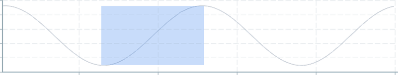
The size and position of the rectangle are controlled with xMin, xMax, yMin and yMax values. These are typically set via accessor syntax, but may also be set manually.
import { BoxAnnotation } from '@electricui/components-desktop-charts' <BoxAnnotation dataSource ={closestToMouseDS } accessor ={(data , time ) => ({ xMin : time -100, yMin : 0, xMax : time + 100, yMax : 1000 })} color ={Colors .BLUE4 } opacity ={0.4}/>import { BoxAnnotation } from '@electricui/components-desktop-charts' <BoxAnnotation xMin ={6000} xMax ={7000} yMin ={0} yMax ={1000} color ={Colors .DARK_GRAY3 } opacity ={0.3} />BoxAnnotation supports the same visual formatting controls such as color and opacity, but does not include an outline stroke.
The colour can be specified as a string or number. colorAccessor is available for dynamic control.
<BoxAnnotation color ={Colors .BLUE3 } /><BoxAnnotation color ="blue" /><BoxAnnotation color ="#0066CC" />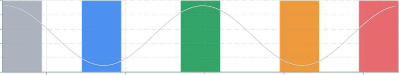
<BoxAnnotation color ={Colors .GRAY4 } /><BoxAnnotation color ={Colors .BLUE4 } /><BoxAnnotation color ={Colors .GREEN4 } /><BoxAnnotation color ={Colors .ORANGE4 } /><BoxAnnotation color ={Colors .RED4 } />The opacity can be specified as a number between 0.0 and 1.0. opacitySource and opacityAccessor are available for dynamic control.

<BoxAnnotation opacity ={0.1} /><BoxAnnotation opacity ={0.25} /><BoxAnnotation opacity ={0.5} /><BoxAnnotation opacity ={0.75} /><BoxAnnotation opacity ={1} />LineSegment Annotation
Arbitrary lines between two co-ordinates. Supports the full styling controls found with other Line annotations such as color, opacity, dashes, etc.
These annotations are typically used as one of the building blocks when building application specific annotations alongside the more advanced operators (search, mouse).

<LineSegmentAnnotation />The color can be specified as a string or number. colorAccessor is available for dynamic control.

<LineSegmentAnnotation color ={Colors .BLUE3 } /><LineSegmentAnnotation color ="blue" /><LineSegmentAnnotation color ="#0066CC" />The thickness of the line is controlled with lineWidth with number values starting at 1 pixel width (default).
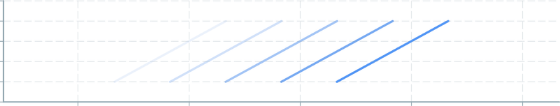
<LineSegmentAnnotation color ={Colors .GRAY4 } lineWidth ={1} /><LineSegmentAnnotation color ={Colors .BLUE4 } lineWidth ={2} /><LineSegmentAnnotation color ={Colors .GREEN4 } lineWidth ={4} /><LineSegmentAnnotation color ={Colors .ORANGE4 } lineWidth ={8} /><LineSegmentAnnotation color ={Colors .RED4 } lineWidth ={12} />The opacity can be specified as a number between 0.0 and 1.0. opacitySource and opacityAccessor are available for dynamic control.
<LineSegmentAnnotation opacity ={0.1} /><LineSegmentAnnotation opacity ={0.25} /><LineSegmentAnnotation opacity ={0.5} /><LineSegmentAnnotation opacity ={0.75} /><LineSegmentAnnotation opacity ={1} />When rendering multiple lines for a more complex annotation, we recommend using the batchIngest API for better performance and ergonomics.
Each ingest() requires argument inputs for the segment's start and end positions and colors in discrete rgba format, using the following order:
x1: number, y1: number, x2: number, y2: number, r1: number, g1: number, b1: number, a1: number, r2: number, g2: number, b2: number, a2: numberA staticColor helper instance is also provided, providing a parser for CSS hex style colours into RGB triples.
The usage of this
batchIngestdisables theaccessorandcolorAccessorAPIs.
continuitySource,continuityAccessor, andblankTriggerAPIs may still be used
<LineSegmentAnnotation dataSource ={closestPeaks } batchIngestion ={(data , time , tags , ingest , blank , staticColor ) => { if (data ) { staticColor .set (tags .hasDragged ? Colors .GRAY5 : Colors .GRAY3 ) const alpha = 0.6 // Left ingest ( data .leftX , data .leftY , data .leftX , data .mouseData .chartYMin + 0.1, staticColor .r , staticColor .g , staticColor .b , alpha , staticColor .r , staticColor .g , staticColor .b , alpha , ) // Right ingest ( data .rightX , data .rightY , data .rightX , data .mouseData .chartYMin + 0.1, staticColor .r , staticColor .g , staticColor .b , alpha , staticColor .r , staticColor .g , staticColor .b , alpha , ) // Bottom ingest ( data .leftX , data .mouseData .chartYMin + 0.1, data .rightX , data .mouseData .chartYMin + 0.1, staticColor .r , staticColor .g , staticColor .b , alpha , staticColor .r , staticColor .g , staticColor .b , alpha , ) } }}/>