Divider
Dividers allow for visual separation of components with a padded horizontal or vertical line.

Usage
A Divider is a renderable component used for styling of your UI.
import { Divider } from '@blueprintjs/core' <Divider />Generally, you want to divide components which are in a common block, like a ButtonGroup or RadioGroup. Use a Divider in the group, and it automatically take the correct orientation of the parent group.

<ButtonGroup minimal > <Button >Hounds</Button > <Button >Sharks</Button > <Divider /> <Button >Flamingos</Button ></ButtonGroup >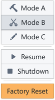
<ButtonGroup vertical > <Button icon ="build">Mode A</Button > <Button icon ="cut" active > Mode B </Button > <Button icon ="edit">Mode C</Button > <Divider /> <Button icon ="play">Resume</Button > <Button icon ="stop">Shutdown</Button > <Divider /> <Button intent ="warning">Factory Reset</Button ></ButtonGroup >