NonIdealState
NonIdealState acts as a placeholder block of text which fills areas when other UI components aren't ready to render. Optional icons and actions allow for contextual interaction.
Usage
NonIdealState accepts any combination of title, icon, description, action and children and will render them in a vertically padded layout.
The NonIdealState will automatically center itself inside it's container, and expand to fill available width if required.

import { NonIdealState } from '@blueprintjs/core' <NonIdealState title ="Expansion Missing" description ="Insert a compatible expansion sensor to view sensor data"/>
<NonIdealState title ="Fatal Error" icon ="flame" description ="Apparently the box is on fire"/>Actions
The action property allows use of normal components as part of the NonIdealState block. These are most useful as a way to trigger a retry or prompt for valid user input.
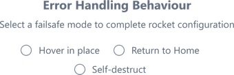
<NonIdealState title ="Error Handling Behaviour" description ="Select a failsafe mode to complete rocket configuration" action ={ <RadioGroup inline accessor ="flight_mode"> <RadioGroup .Radio value ={0} label ="Hover in place" /> <RadioGroup .Radio value ={1} label ="Return to Home" /> <RadioGroup .Radio value ={2} label ="Self-destruct" /> </RadioGroup > }/>Children
Passing children is a cleaner way of drawing more complex components. Child objects render below/after the action content if specified.
Raw strings will not be formatted as children.
<NonIdealState title ="Value out of Range" description ="Oops! We didn't expect this..."> <div > <>Something Here</> <>Something Else</> </div ></NonIdealState >