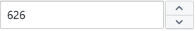
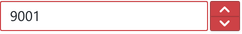
NumberInput
NumberInput is a text input field focussed on input and manipulation of numeric data. It provides increment/decrement chevrons and inbuilt keyboard shortcuts for arrow keys.
Usage
A static writer that sets the motor_pwm messageID, and updates based on inbound changes from the microcontroller:
import { NumberInput } from '@electricui/components-desktop-blueprint' <NumberInput accessor ="motor_pwm" />When interacting with a structure member, standard writer usage applies.
<NumberInput accessor ={state => state .rgb_settings .red } writer ={(state , value ) => { state .rgb_settings .red = value }}/>Debouncing
It's not always desirable to send variable changes to the microcontroller until the user has finished with their input.
Set the interval between outbound state updates in milliseconds with throttleDuration.
<NumberInput accessor ="motor_pwm" throttleDuration ={500} />Numeric Clamping
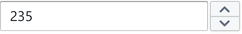
Specifying one or both clamping properties min and max sets the control range of the up/down chevron. When the limit is hit, the chevron (and keyboard value changes) are prevented.
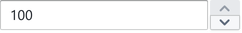
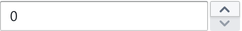
<NumberInput accessor ="motor_pwm" min ={0} max ={100} />Limits on values should be enforced at a firwmare level, and/or with a custom codec.
Do not rely on the clamping behaviour to prevent out-of-range operation.
Formatting
Size
Use the large property to increase the size.
<NumberInput accessor ="pitch_gain" large />Intent Colours
NumberInput accepts an intent property to control the colour.

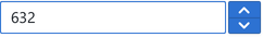
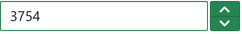
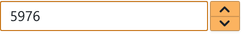
<NumberInput accessor ="target_speed" intent ="primary" />or use the Intent enum specifically.
import { Intent } from '@blueprintjs/core' <NumberInput accessor ="target_speed" intent ={Intent .PRIMARY } />Icon
An icon can render on the left-hand side of the input by specifying a leftIcon property.
See the Icon component for details.
The icon will automatically inherit the intent colours if active.
<NumberInput accessor ="strobe_duty" leftIcon ="flash" />or explicitly
import { IconNames } from '@blueprintjs/icons' <NumberInput accessor ="strobe_duty" leftIcon ={IconNames .FLASH } />