Popover
Popovers provide a floating overlay for interactive content and layouts, typically triggered by a button press.
Usage
Popover's require a target element to trigger the display, and content to draw in the overlay area.
The ordering of the wrapped components is strict. The trigger component (such as a button) is specified first, followed by the <Content> </Content> which wraps the layout drawn in the overlay.
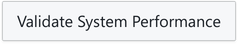
This example inlines a small layout in a <div>.
import { Popover } from '@blueprintjs/core'import { Button as BlueprintButton } from '@blueprintjs/core'import { Button } from '@electricui/components-desktop-blueprint' <Popover > <BlueprintButton large >Validate System Performance</BlueprintButton > <div style ={{ padding : '20px' }}> <h3 >Test duration (minutes)</h3 > <Slider > <Slider .Handle accessor ="cycle_duration" /> </Slider > <br /> <Button large fill intent ="primary" callback ="start_cycle"> Begin Self-Test </Button > </div ></Popover >Position Control
The position of the Popover relative to the trigger can manually controlled with the position property.
By default, the Popover will be automatically positioned to fit in the available area.
This prop accepts the positions as strings or with enum values after importing Position.
<Popover position ="right"> ...</Popover >import { Position } from '@blueprintjs/core' <Popover position ={Position .RIGHT }> ...</Popover >Positions include the side of the trigger, and alignment to an edge.
TOPTOP_LEFTTOP_RIGHTLEFTLEFT_TOPLEFT_BOTTOMRIGHTRIGHT_TOPRIGHT_BOTTOMBOTTOMBOTTOM_LEFTBOTTOM_RIGHTInteraction Controls
The Popover open and close behaviours can be specified for hover or click invocations using the interactionKind property specified as a string, or as a PopoverInteractionKind enum.
import { PopoverInteractionKind } from '@blueprintjs/core' <Popover interactionKind ={PopoverInteractionKind .HOVER }> <Button text ="Open" /> <div > ... </div ></Popover >HOVER Opens when cursor is hovering over the target Closes once cursor leaves the target OR the popoverHOVER_TARGET_ONLY Opens when the cursor is hovering over the target Closes when the cursor leaves the targetCLICK Opens when target is clicked Closes when any next click occursCLICK_TARGET_ONLY Opens when target is clicked Closes when target is clickedHover Interaction Delays
When using a Popover with a hover style interaction, the animation and interaction can cause usability issues:
- User drags cursor over and past the element, making the popover flicker
- User has trouble holding the cursor on the trigger reliably
- Content in the popover needs time to draw or execute logic
The hoverCloseDelay and hoverOpenDelay props accept Number inputs in milliseconds which shifts the start of the open/close animation.
<Popover hoverCloseDelay ={100} hoverOpenDelay ={20} />Minimal Style & Animation
The popover arrow can be removed, and the animation simplified for faster workflows.
<Popover minimal />To control the animation, the transitionDuration prop accepts a Number in milliseconds specifying how long the open/close animation takes to complete.
<Popover transitionDuration ={50} />