RadioGroup
Radio Groups allow configuration of a variable with an arbitrary amount of possible values, by exposing each state option as a Radio Button.
Usage
This group writes to the motor_pwm variable, with values corresponding to the radio button selected by the user.

import { RadioGroup } from '@electricui/components-desktop-blueprint' <RadioGroup accessor ="motor_pwm"> <RadioGroup .Radio value ={25} label ="Slow" /> <RadioGroup .Radio value ={140} label ="Fast" /> <RadioGroup .Radio value ={240} label ="Insane" /></RadioGroup >Or with functional writers.
<RadioGroup accessor={state => state.motor_pwm} writer={(state, value) => { state.motor_pwm = value }}> <RadioGroup.Radio value={25} label="Slow" /> <RadioGroup.Radio value={140} label="Fast" /> <RadioGroup.Radio value={240} label="Insane" /></RadioGroup>Labels
Both the RadioGroup and RadioGroup.Radio both accept the optional label="string" property.
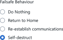
<RadioGroup accessor ="fs_mode" label ="Failsafe Behaviour"> <RadioGroup .Radio value ={0} label ="Do Nothing" /> <RadioGroup .Radio value ={1} label ="Return to Home" /> <RadioGroup .Radio value ={2} label ="Re-establish communications" /> <RadioGroup .Radio value ={3} label ="Self-destruct" /></RadioGroup >Alignment
The RadioGroup.Radio components have configurable label alignment.

<div style ={{ maxWidth : '150px' }}> <RadioGroup accessor ="mode"> <RadioGroup .Radio value ={0} label ="Left Aligned" alignIndicator ="left" /> <RadioGroup .Radio value ={1} label ="Right Aligned" alignIndicator ="right" /> </RadioGroup ></div >The label will attempt to left-align (unless using a RTL language set) regardless of the indicator alignment, so consider wrapping the component in a fixed-width <div> as shown to avoid the issue demonstrated below:

Horizontal vs Vertical groups
By default, the RadioGroup will order child RadioGroup.Radio components in a vertical list.
Inclusion of the inline property on RadioGroup formats the group horizontally.

<RadioGroup accessor ="sel_sound" inline > <RadioGroup .Radio value ={0} label ="Cow" /> <RadioGroup .Radio value ={1} label ="Chicken" /></RadioGroup >We strongly recommend considering the label alignment context when using
inline, as it represents a potential source of confusion for your users.Consider a
Dropdowncomponent for similar functionality.