Slider
Sliders allow the user to interact with a numeric variable inside a constrained range. Multi-Sliders allow an arbitrary number of handles, forming the basis of user-configurable ranges.

Usage
Sliders are a two part component, the linear "rail" which represents the allowable numeric range, and the handle, which represents the selected value. A single slider supports many handles.
import { Slider } from '@electricui/components-desktop-blueprint' <Slider > <Slider .Handle accessor ="delay_time" /></Slider >When using accessor syntax with arrays or structure members, all handles on the slider need to have a name assigned. The name strings help the writer syntax build the final StateTree.
<Slider writer ={(state , values ) => { state .rgb .red = values .slider_handle_named_red }}> <Slider .Handle name ="slider_handle_named_red" accessor ={state => state .rgb .red } /></Slider >Min/Max, Step Size
The min and max properties set the numeric range over which the slider operates. By default the minimum is 0, and the maximum is 10.
These ranges set on the parent Slider component.
<Slider min ={5} max ={30}> <Slider .Handle accessor ="delay_time" /></Slider >It's useful to control the size of each minimum 'step' made as the slider drags with the stepSize property. This means the slider provides coarser steps over the allowable numeric range.
stepSize defaults to 1, must be greater than 0, and will impact all child Slider.Handle components.
This example demonstrates 5 select-able steps over a 200 digit range (0, 50, 100, 150, 200).
<Slider min ={0} max ={200} stepSize ={50}> <Slider .Handle accessor ="delay_time" /></Slider >OnRelease or Continuous Send
For lighting systems, variable configurations, or dynamic control systems, it's desirable to reflect user interaction in the hardware system instantly. By default, sliders will commit the value to the device once the handle is released (mouse/touch up).
Configuring the sendOnlyOnRelease property allows continuous variable output.
<Slider sendOnlyOnRelease ={false}> <Slider .Handle accessor ="brightness" /></Slider >As the connections handler performs deduplication on the outbound queue, data will not be sent to the device unless a value change has occurred. In combination with a sensible step-size, this can provide responsive real-time interaction without an unnecessary high rate of updates.
Labels
The Slider rail provides formatting control to make data more human friendly. Labels have configurable step-size, and configurable precision used when printing.
The labelStepSize prop sets the distance between printed labels. Defaults to 1, must be greater than 0.
Use labelPrecision to control the number of decimal places used in labels. By default, precision is inferred from the stepSize property.
This allows floating point sliders to notate marks with a '0.25' interval, rather than '0.2500000'.
<Slider min ={0} max ={5} stepSize ={0.25} labelStepSize ={0.5}> <Slider .Handle accessor ="tank_level" /></Slider >Custom Formatting
Control label formatting with custom string creation. This example demonstrates conversions to a percentage scale with associated symbol.
labelPrecision settings are overridden by use of labelRenderer.

<Slider min ={0} max ={1} stepSize ={0.01} labelStepSize ={0.2} labelRenderer ={(val : number) => `${Math .round (val * 100)}%`}> <Slider .Handle accessor ="tank_setpoint" /></Slider >Vertical Sliders
A slider can rotate 90° with the vertical property. When rotated, the text and tooltip move to one side.
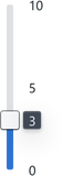
<Slider vertical > <Slider .Handle accessor ="height-adjust" /></Slider >Multiple Handles
More than one handle can attach to the same slider frame. This allows configuration of several variables inside the same range, such as the min and max temperatures used for an environmental monitoring alarm.

<Slider > <Slider .Handle accessor ="valueA" /> <Slider .Handle accessor ="valueB" /></Slider >n-Handle Interaction
When multiple handles exist on the same slider, restricting the handle's ability to pass another handle provides clearer UX behaviour.
interactionKind | Description |
|---|---|
lock | User's active handle 'stops' when attempting to drag past another handle. |
push | User's active handle is allowed to overlap and exceed other handles. |
none | Are not rendered or interactive. Setting a handle to none helps break track into subsections for finer color customisation. |
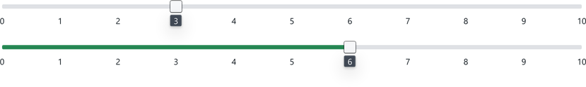
Colouring by Intent
Modifying the colour of a slider can help improve the readability of your UI. This uses the same Intent system as other components, exposed through properties to colour the slider before or after a given handle.
The slider's default intent is configurable, or disabled entirely.
By default, a single handle will fill before itself with Intent.Primary (Blue). Multi-handle sliders have no automatic intent.
<Slider showTrackFill ={false}> <Slider .Handle accessor ="speed"/></Slider ><Slider defaultTrackIntent ="success"> <Slider .Handle accessor ="speed"/></Slider >Advanced Colouring
Handles have the ability to set the colour of the slider with intentBefore and intentAfter. This can allow for powerful visual customisation with multiple handles.

<Slider min ={0} max ={50} labelStepSize ={10} defaultTrackIntent ="success"> <Slider .Handle accessor ="cold_thresh" intentBefore ="primary" /> <Slider .Handle accessor ="hot_thresh" intentAfter ="warning" /></Slider >The logical extension is to control a pair of warning/error range values in a single slider.

<Slider min ={0} max ={100} labelStepSize ={25} defaultTrackIntent ="success"> <Slider .Handle accessor ="error_cold" intentBefore ="danger" /> <Slider .Handle accessor ="warn_cold" intentBefore ="warning" /> <Slider .Handle accessor ="warn_hot" intentAfter ="warning" /> <Slider .Handle accessor ="error_hot" intentAfter ="danger" /></Slider >