Tag
Callouts provide presentation of content in a visually distinct manner. Includes a heading, icon and typically text-based content.

Usage
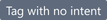
Tag is passed text and rendered in a small neutral bubble by default.
import { Tag } from '@blueprintjs/core' <Tag > Firmware 1.0</Tag >Size
The size of the label has a toggle with the large property.

<Tag large >Bigger and better</Tag >Use fill to span the width of the parent container.

<Tag fill >Long text goes here</Tag >Intent
Tags have configurable intent settings for colour control.

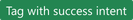
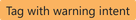

<Tag intent ="warning"> Electronics might be on fire!</Tag >As with all other components, the intent prop also accepts an enum value.
import { Tag , Intent } from '@blueprintjs/core' <Tag intent ={Intent .DANGER }> Yep, that's smoke...</Tag >Minimal Appearance
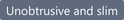
The minimal prop reduces the visual impact of the Tag by reducing contrast.

<Tag minimal >Subtle styling</Tag >Use of minimal will override intent colouring for a softer appearance.


Icon
Add an icon or rightIcon by specifying the name of the icon as a string or IconNames enum value.
import { IconNames } from "@blueprintjs/icons"; <Tag icon ={IconNames .AIRPLANE }> Is it a bird?</Tag ><Tag rightIcon ="airplane"> Is it a plane?</Tag >