TextInput
TextInput is a input field intended for use with editable strings and character data.

Usage
The TextInput field uses standard accessor syntax and will display current string values from the microcontroller, and accepts user input to write/modify strings.
import { TextInput } from '@electricui/components-desktop-blueprint' <TextInput accessor ="dev_nickname" />Or with functional writer syntax.
import { TextInput } from '@electricui/components-desktop-blueprint' <TextInput accessor ={state => state .dev_nickname } writer ={(state , value ) => { state .dev_nickname = value }}/>Debouncing
It's not always desirable to send variable changes to the microcontroller until the user has finished with their input.
Set the duration between state pushes to hardware (in milliseconds) with throttleDuration.
The duration counts down from the last user input event, and writes the value once the delay elapses.
<TextInput accessor ="dev_nickname" throttleDuration ={750} />Limiting string length
Embedded hardware often has fixed length buffers for strings. The maxLength number property prevents text input after hitting the threshold.
<TextInput accessor ="wifi_ssid" maxLength ={32} />This length is intended as user-facing input restriction, and does not take null/termination bytes into account.
Placeholder Text
It is common to use TextInput in situations where the hardware hasn't provided existing state. i.e. password credentials, user-overrides.
The placeholder prop accepts a string and renders when no valid string is available in the state tree. To prevent confusion, the text is lower contrast.

<TextInput accessor ="password" placeholder ="Enter the WiFi Password" />For clear UX, avoid setting the placeholder to a string matching a typical input.
i.e. Don't use "t0rn4dO" as the placeholder for a password input.
Formatting
Constraining width
The default behaviour is to fill the available width of the container. To restrict a TextInput in a basic case, create a narrower container (this example is half the width of the parent container).
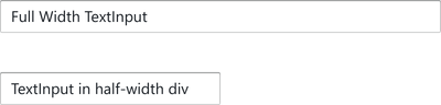
<div style ={{ maxWidth : '50%' }}> <TextInput accessor ="dev_nickname" /></div >Rounded Edges
Use the round property for semi-circular endcaps.

<TextInput accessor ="username" round />Size
Use the large property to increase the size. Use small to decrease the size


<TextInput accessor ="pitch_gain" large /><TextInput accessor ="roll_damping" small />Intent Colours
TextInput accepts an intent property to control the colour of the frame.


<TextInput accessor ="robot_name" intent ="success" />or specify the Intent enum:
import { Intent } from '@blueprintjs/core' <TextInput accessor ="robot_name" intent ={Intent .SUCCESS } />Icon
Render an icon on the left-hand side of the input by specifying a leftIcon property.
See the Icon component for details.
The icon will automatically inherit the intent colours if active.
<TextInput accessor ="fleet-id" leftIcon ="tractor" />