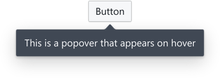
Tooltip
Tooltip provides a on-hover label element to wrapped child components, used for hinting or providing context for UI elements.
Usage
A Tooltip behaves as a wrapper for other components, supports hover interactions, and is typically used for displaying text.
import { Tooltip } from '@blueprintjs/core' <Tooltip content ="Click me!"> <Button >Important Button</Button ></Tooltip >Position Control
The position property allows control over the tooltip's position.
By default (nothing specified), the auto position picks the best position that will allow the full popover to be visible while the user scrolls.
This prop accepts the positions as strings or with enum values after importing Position.
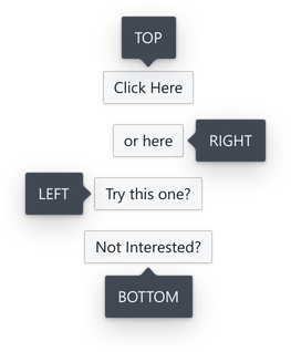
<Tooltip content ="TOP" position ="top"> <Button >Click Here</Button ></Tooltip >import { Position } from '@blueprintjs/core' <Tooltip content ="RIGHT" position ={Position .RIGHT }> <Button >or here</Button ></Tooltip >For larger items, the tooltip can align to an edge
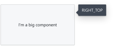
<Tooltip content ="On the right" position ={Position .RIGHT }> <Button >Another Button</Button ></Tooltip >The full set of positions is:
AUTOTOPTOP_LEFTTOP_RIGHTLEFTLEFT_TOPLEFT_BOTTOMRIGHTRIGHT_TOPRIGHT_BOTTOMBOTTOMBOTTOM_LEFTBOTTOM_RIGHTIntent Colours
Tooltips accept colours to highlight importance.
Intents can be a string, or Intent enum values.
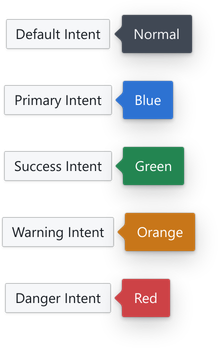
<Tooltip content ="Blue" intent ="primary"> <Button >Primary Intent</Button ></Tooltip >import { Intent } from '@blueprintjs/core' <Tooltip content ="Green" intent ={Intent .SUCCESS }> <Button >Success Intent</Button ></Tooltip >Displaying other content
The content property also accepts any arbitrary JSX. As with any other components, multiple components need to be wrapped with either a fragment (<> </>) or another tag.
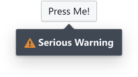
<Tooltip content ={ <div > <Icon icon ="warning-sign" /> <b >Serious Warning</b > </div > }> <Button >Press Me!</Button ></Tooltip >This style of content display can render any normal component or full layout if desired.
As tooltips are for display of simple information, we recommend putting interactive or complex components in a user-invoked
Popoverinstead.