Visualising Confidence Intervals
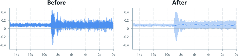
In this example, a hard mounted IMU is streaming samples to the UI at a high rate while attempting to detect small movements.
A simple LineChart of the raw data doesn't help visualise the underlying behaviour, so we'll learn how to render a filtered line with a shaded region representing data within a confidence window, helping to visualise the noise distribution and underlying motion.
Input Data
The IMU is sending accelerometer samples at 1kHz. Because the external vibrations are very small, the noisy readings result in a banded appearance when plotted with the LineChart.

import { Colors } from '@blueprintjs/core'import { ChartContainer , LineChart , AreaChart , TimeAxis , VerticalAxis , RealTimeDomain ,} from '@electricui/components-desktop-charts'import { useMessageDataSource } from '@electricui/core-timeseries' const OverviewPage = () => { const dataSource = useMessageDataSource ('acc') return ( <React .Fragment > <ChartContainer > <LineChart dataSource ={dataSource } accessor ={data => data .accX } color ={Colors .BLUE4 } /> <TimeAxis /> <VerticalAxis /> <RealTimeDomain window ={30_000} /> </ChartContainer > </React .Fragment > )}If you're following along with similarly high rate data, you might need to tell the
LineChartto render a higher number of items,maxItems={50000}or as appropriate for your expected window.
This visualisation isn't ideal for a few reasons:
- We can't see all of the data as it's denser than our display's horizontal pixel count,
- Mouse hover readouts are harder to use as the cursor is constantly moving vertically between the noisy values
- We need to provide measurements that better describe the signal's behaviour
Calculating Statistics
This is the kind of situation that Electric UI's DataFlow engine was designed for. Depending on your data, you might have different filters or stats that are useful, but the overall process should be similar.
We'll need to use a few different techniques to prepare the data for our visualisations:
- A windowed statistics operator will stride over the data, selecting a 100ms slice of data
- For each given time slice, we want to know the median and some upper and lower thresholds to help reject outliers.
- The
quantilesoperator is perfect here. - We'll calculate the 10th and 90th percentiles for the upper/lower outlier rejection, and
- also calculate the 50th percentile as that represents the median.
- The
- The three quantile values will then be emitted as a number array
number[], and we'll use these values for the chart instead of the raw data.
import { useDataTransformer } from '@electricui/timeseries-react'import { window , quantiles } from '@electricui/dataflow' const OverviewPage = () => { const dataSource = useMessageDataSource ('acc') const dataTransformer = useDataTransformer (() => { const slice = window (dataSource , 100) const stats = quantiles ( slice , [0.1, 0.5, 0.9], { accessor : (data ) => data .accX } ) return stats }) // ...Charting
We'll be drawing two types of chart, a LineChart to display the median, and a de-emphasised AreaChart to provide context with the range of values for that slice.
Remember that draw order matches the top-to-bottom order of children in the ChartContainer, so the LineChart should be drawn after the AreaChart.
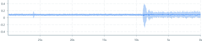
<AreaChart dataSource ={dataTransformer } accessor ={(data ) => ({ yMin : data [0], yMax : data [2] })} color ={Colors .BLUE4 } opacity ={0.4} maxItems ={50000}/><LineChart dataSource ={dataTransformer } accessor ={data => data [1]} color ={Colors .BLUE4 } />That wasn't too hard!
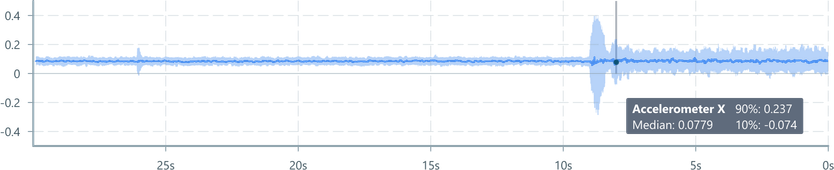
Now lets add a user-interactive tool-tip to make inspecting part of the data easier.
We need to import a few extra components
import { DataSourcePrinter , useMouseSignal , MouseCapture , PointAnnotation , VerticalLineAnnotation } from '@electricui/components-desktop-charts'import { MouseAttached } from '@electricui/charts'import { closestByValue } from '@electricui/dataflow'import { Composition } from 'atomic-layout'import { Tag } from '@blueprintjs/core'Then we setup the mouse driven interactions, a DataTransformer to search for data near the cursor, and a VerticalLineAnnotation to make the selection point visually apparent.
const OverviewPage = () => { const dataSource = useMessageDataSource ('acc') const dataTransformer = useDataTransformer (() => { const slice = window (dataSource , 100) const stats = quantiles ( slice , [0.1, 0.5, 0.9], {accessor : (data ) => data .accX } ) return stats }) const [mouseSignalAll , captureRef ] = useMouseSignal () const mouseSignal = mouseSignalAll .withChartID ('primary') const closest = closestByValue (dataTransformer , mouseSignal , { searchValueAccessor : data => data .x , valueAccessor : (data , time ) => time , }) return ( <React .Fragment > <ChartContainer id ="primary"> <AreaChart dataSource ={dataTransformer } accessor ={(data ) => ({ yMin : data [0], yMax : data [2] })} color ={Colors .BLUE4 } opacity ={0.4} maxItems ={50000} /> <LineChart dataSource ={dataTransformer } accessor ={data => data [1]} color ={Colors .BLUE4 } /> <VerticalLineAnnotation dataSource ={closest } accessor ={(closestEvent ) => closestEvent .time } visibilitySource ={mouseSignal } visibilityAccessor ={mouseData => mouseData .hovered } color ={Colors .GRAY1 } opacity ={0.5} /> <MouseCapture captureRef ={captureRef } /> <TimeAxis /> <VerticalAxis /> <RealTimeDomain window ={30_000} /> </ChartContainer > </React .Fragment > )}With this in place, we can add a tooltip to display our statistics near the cursor. We're adding the MouseAttached component inside the ChartContainer which lets us render arbitrary components anchored to the cursor.
<MouseAttached visibilitySource ={mouseSignal } visibilityAccessor ={mouseData => mouseData .hovered }> <Tag intent ="none"> <Composition templateCols ="1fr 1fr" gapCol ={10}> <div > <b >Accelerometer X</b > </div > <div > 90%:{' '} <DataSourcePrinter dataSource ={closest } accessor ={closestEvent => closestEvent .data [2]} /> </div > <div > Median:{' '} <DataSourcePrinter dataSource ={closest } accessor ={closestEvent => closestEvent .data [1]} defaultValue ="..." precision ={3} limitUpdateRate ={200} /> </div > <div > 10%:{' '} <DataSourcePrinter dataSource ={closest } accessor ={closestEvent => closestEvent .data [0]} /> </div > </Composition > </Tag ></MouseAttached >By using the mouseSignal metadata for hover state with the visibilityAccessor the annotation will be hidden when the cursor leaves the ChartContainer.
Going further
We've already done the hard work to prepare the data and add interactive annotations, lets go one step further to allow deeper analysis by adding a histogram showing the data distribution in the highlighted slice.
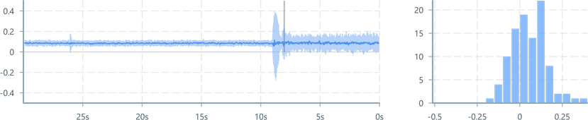
We just add another chart and setup another DataTransformer to help reshape a slice of values into an array of counts. First import the necessary components:
import { histogram } from '@electricui/dataflow'import { BarChart , BarChartDomain , VerticalAxis , HorizontalAxis } from '@electricui/components-desktop-charts'Then we use the histogram dataflow to prepare our data, and then ensure the mouse signal is driving the query. Then it's as simple as building a simple BarChart in a new ChartContainer.
const histogramData = useDataTransformer (() => { const data = window (dataSource , 100) const histo = histogram ( data , -0.5, 0.5, // range 20, // max columns to bucket { accessor : (data , time , tags ) => data .accX } ) return histo }) const selectHistogramInteractively = closestByValue (histogramData , mouseSignal , { searchValueAccessor : data => data .x , valueAccessor : (data , time ) => time , }) return ( <React .Fragment > {/* Existing chart, etc */} <ChartContainer > <BarChart dataSource ={selectHistogramInteractively } accessor ={closestEvent => closestEvent .data } columns ={20} color ={Colors .BLUE5 } /> <HorizontalAxis tickFormat ={i => `${(i -10)/20}`} /> <VerticalAxis /> <BarChartDomain /> </ChartContainer >