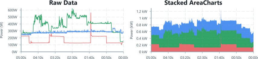
Stacked AreaCharts
In this example, we'll go from simple three phase power consumption measurements to a more intuitive total consumption chart by stacking the AreaChart.
Input Data
For this example, the hardware is sampling, processing and then sending power measurements for three phases. This data is provided to the UI in structured form,
export interface PowerData { phaseA : number // data is in Watts phaseB : number phaseC : number}To see what the data looks like first, we'll manually visualise the data with a LineChart per phase:
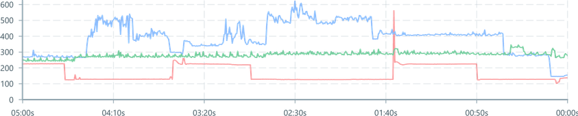
import { Colors } from '@blueprintjs/core'import { ChartContainer , LineChart , TimeAxis , VerticalAxis , RealTimeDomain ,} from '@electricui/components-desktop-charts'import { useMessageDataSource } from '@electricui/core-timeseries' const OverviewPage = () => { const dataSource = useMessageDataSource ('power') return ( <React .Fragment > <ChartContainer > <LineChart dataSource ={dataSource } accessor ={data => data .phaseA } color ={Colors .RED5 } /> <LineChart dataSource ={dataSource } accessor ={data => data .phaseB } color ={Colors .BLUE5 } /> <LineChart dataSource ={dataSource } accessor ={data => data .phaseC } color ={Colors .GREEN5 } /> <TimeAxis /> <VerticalAxis /> <RealTimeDomain window ={300_000} delay ={500} /> </ChartContainer > </React .Fragment > )}But visualising each phase individually isn't needed here - we want to chart the total power consumption and then provide per-phase breakdowns as statistics alongside the chart.
As the power consumption on each phase can be summed to give the total instantaneous power consumption, a stacked series of AreaCharts are a better chart type to use.
First, we'll refactor our simple chart to separate formatting details from the charting logic. This doesn't visually change our chart.
import { useMessageDataSource , GetEventData } from '@electricui/core-timeseries' const dataSource = useMessageDataSource ('power') const keyedData = { phaseA : { color : Colors .RED4 , name : 'A', }, phaseB : { color : Colors .GREEN4 , name : 'B', }, phaseC : { color : Colors .BLUE4 , name : 'C', }, } as const const phases = Object .entries (keyedData ).map (([key , data ]) => ({ key : key as keyof typeof keyedData , color : data .color , name : data .name , })) return ( <React .Fragment > <ChartContainer > {phases .map ((signal , index , array ) => { return ( <LineChart key ={signal .key } dataSource ={dataSource } accessor ={data => data [signal .key ]} color ={signal .color } /> ) })} {/* Axis, Domain, etc */} </ChartContainer >Changing the LineChart to an AreaChart is straightforward, but the occlusion of the phaseA data is a good reminder of why AreaChart shouldn't be used as-is with multi-series data.
import { AreaChart } from '@electricui/components-desktop-charts'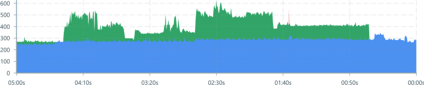
Calculating shaded regions
We need to calculate new minimum and maximum y values for each phase which include sum the data 'below' them on the chart. Because we refactored into the procedural charting approach earlier, we can do everything alongside the AreaChart display code:
- From the
map()we are working with one of the phases data, and we're given theindexin the array. - We need to know which signals which precede the current one, as the sum of those values is the lowest or starting y-axis of this AreaChart.
- We'll call it
minStack. - It's any signal with an index less than the current index.
- We'll call it
- We can include the current signal to describe the data which stacks to the maximum y-value for this AreaChart.
- We'll call this one
maxStack. - Any signal under or equal to the current index.
- We'll call this one
- The
AreaChartaccessor acceptsyMinandyMaxvalues to specify the shaded area.- The
reduce()function is a convenient approach to walking an array values and returning a single value. Adding the current value to the previous achieves our accumulation logic. - By reducing on the filtered array of signals
minStackandmaxStackwe're calculating the lower and upper sum values we want to render.
- The
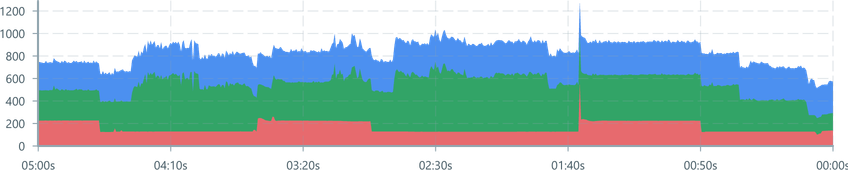
<ChartContainer > {phases .map ((signal , index , array ) => { const minStack = array .filter ((signal , i ) => i < index ) const maxStack = array .filter ((signal , i ) => i <= index ) return ( <AreaChart key ={signal .key } dataSource ={dataSource } accessor ={data => ({ yMin : minStack .reduce ( (prev , current ) => prev + data [current .key ], 0, ), yMax : maxStack .reduce ( (prev , current ) => prev + data [current .key ], 0, ), })} color ={signal .color } /> ) })} {/* Axis, Domain, etc */}</ChartContainer >For some finishing touches, we'll format the y-axis.
<VerticalAxis label ="Power (kW)" tickFormat ={(tick : number, index : number, ticks : number[]) => `${tick / 1000} kW` } labelPadding ={60}/>Relative Percentage Plot
In some situations, we might need to compare the input signals based on their relative contribution to a total. In this situation we're stacking a series of AreaChart regions which show each phases' contribution percentage, and the combination represents 100%.
This only needs a minor change, we calculate the yMin and yMax values as a percentage by dividing the stacked value by the unfiltered total:
yMin: minStack.reduce((prev, current) => prev + data[current.key], 0) / array.reduce((prev, current) => prev + data[current.key], 0),yMax: maxStack.reduce((prev, current) => prev + data[current.key], 0) / array.reduce((prev, current) => prev + data[current.key], 0)Change the y-axis formatting to match:
<VerticalAxis label ="Phase Contribution" tickFormat ={(tick : number, index : number, ticks : number[]) => `${tick * 100}%` } labelPadding ={50}/>