Layouts
User-facing software needs the ability to structure text and interactive content in a coherent manner.
User interfaces should strive to signal the intent of a page to the user, provide familiar design languages for easier accessibility, and aim to minimise friction in completing the user's task.
From a technical standpoint, positioning interactive components, text, and images in a structured layout is straightforward. However the wide range of screen resolutions and aspect ratios possible for a desktop application, and differing usage patterns or input method can quickly turn a simple layout into a daunting task.
By building modular UI 'components' and wrapping them in an interactive layout system, an application's skeleton can be quickly designed by describing how the layout should appear on various devices.
Grid Layouts
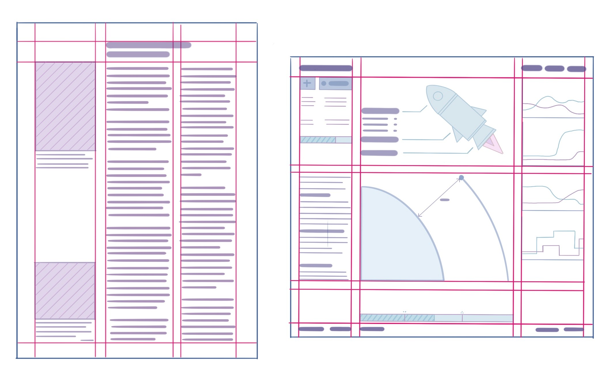
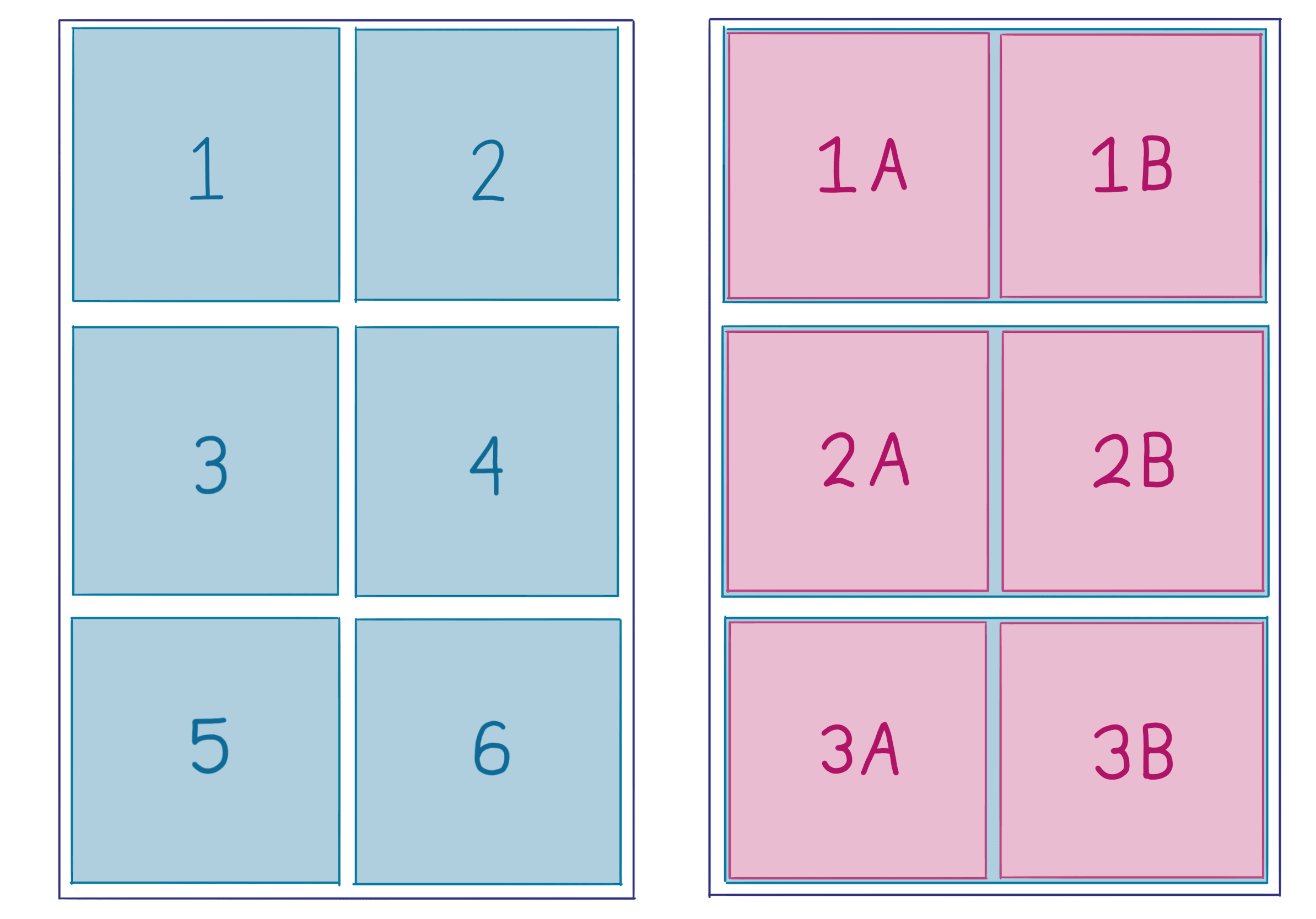
Most layouts can be represented as blocks of content in a rectangular grid pattern. This layout approach has been dominant across print media, the web, and most productivity software. Complexity of the layout is managed by nesting rectangular grid layouts inside each other.
Grid Fundamentals
Grid layouts have some common fundamental properties:
- The area in which the layout lives, like a page in a book, browser context, or application window,
- Margins from the edge of the containing area, and the content
- Columns,
- Blocks of content which use whole column or are separated into rows,
- Alignment of content relative to it's parent column or area
Defining layouts with centralised control over these properties builds a consistent appearance with minimal boilerplate. The separation of content from layout improves modularity, and allows a layout to fluidly respond to a change in window size by switching to a more suitable ruleset.
Regardless of the designer's intent, different user hardware means that a layout might be forced to operate as a touch-interface on a small convertible tablet, or as a dashboard on a widescreen TV. Naive scaling of a layout doesn't work for large changes in view-port size or aspect ratio, so we use Breakpoints to step between different layout styles based on device properties.
Planning an application layout
Try to estimate how what content needs to be displayed and how often a user will use those items. Group similar components to provide logical sections.
If a given action is expected to occur often, it may be wise to anchor that component or text to a fixed bar at the edge of the view-port for fast access. Footers are commonly used for mode summaries or status information, while sidebars or top-menus are used for navigation or control.
While the global application structure might contain persistent values or interactive components, the bulk of content should be grouped logically and displayed clearly. Plan the layout of these views as separate grids from the main application structure, as modular layouts are much easier to re-arrange as a design matures.
Choosing the number of columns is likely one of the first design choices for a content grid, and should be based on the amount of horizontal area. However consider that the same layout can be achieved with different levels of nesting, and by using 'deeper' nested layouts you will find it easier to modify the design later.
In general, consider the following guidelines:
- Each area should have a purpose, and aims to communicate that to the user,
- Focus on the content, remove unnecessary UI components or text where possible,
- Using icons, diagrams or interactive visualisations will communicate context faster than text or charts,
- Use contrast, colour, shape and layout to distinguish different items,
Sketching a layout on paper or in design software can be a useful prototyping step to understand how components might fit together.
Fractional Units
Sizing of content with css has been historically achieved with absolute px pixel or pt point sizes, relative sizes like em and rem, and percentages vw, vh and %. As responsive design principles are now commonplace, high DPI displays are gaining traction, many layouts often needed to perform maths to correctly size content for a given display.
For a layout with a series of columns, the minimum width of content in each column forces the maximum number of columns which can be drawn to screen. Calculating the width of each column then requires an understanding of the view-port width, column width, and total column count.
Fractional units simplify these kinds of layout issues, where 1fr is one fraction of the view-port's size. A layout with equal column spacing can be defined as 1fr 1fr 1fr or repeat(3, 1fr), and wider column sizing can be defined by using larger fractional units.
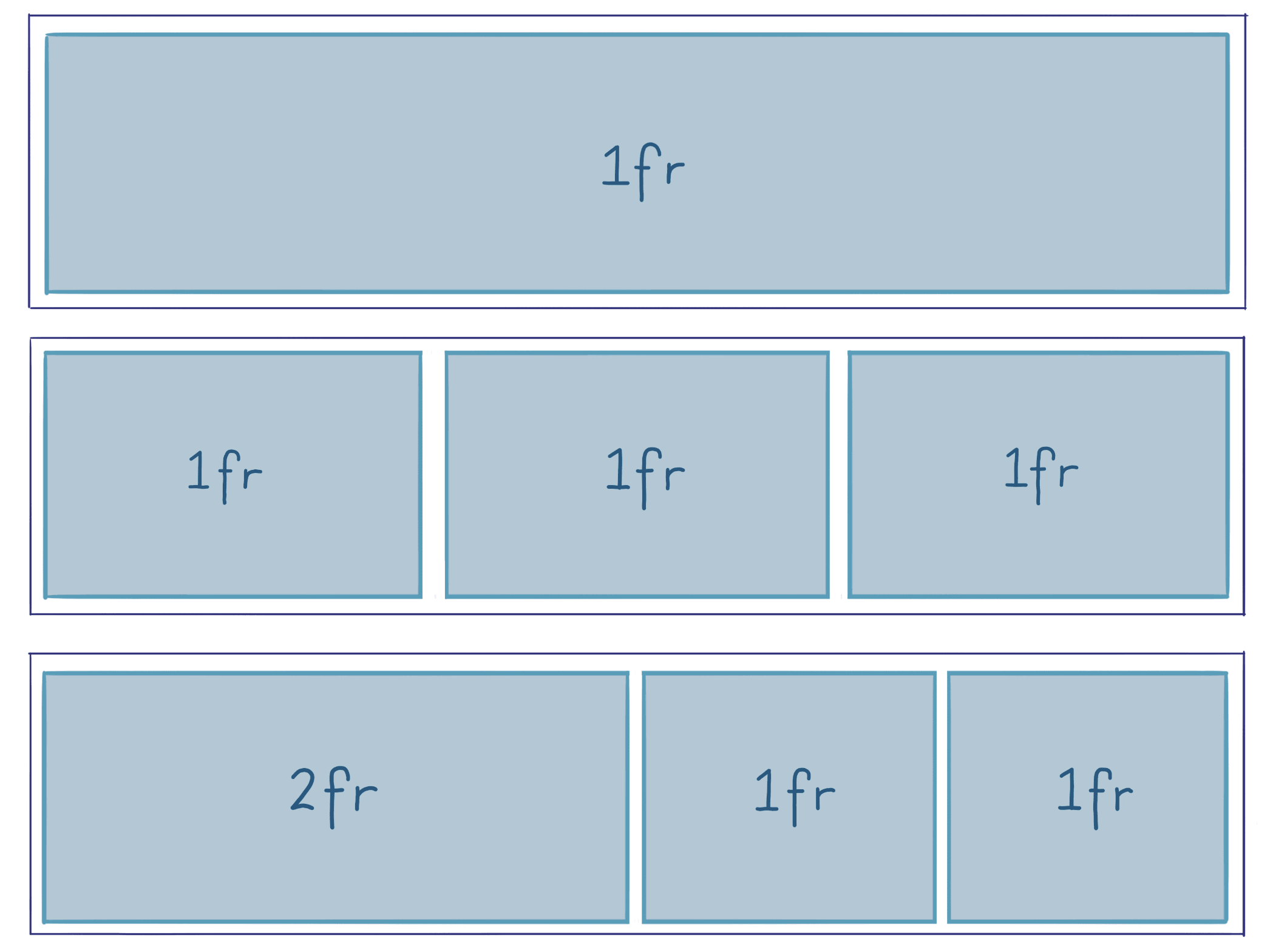
Fractional units are happy being used alongside absolute or relative sizing units, so its also acceptable to specify a column in pixels px then use fr for the remaining columns.
Breakpoints
Deciding when to alter the layout to better accomodate a viewport size is managed using the concept of predefined viewports, which help define the specific conditions which drive changes to the layout.
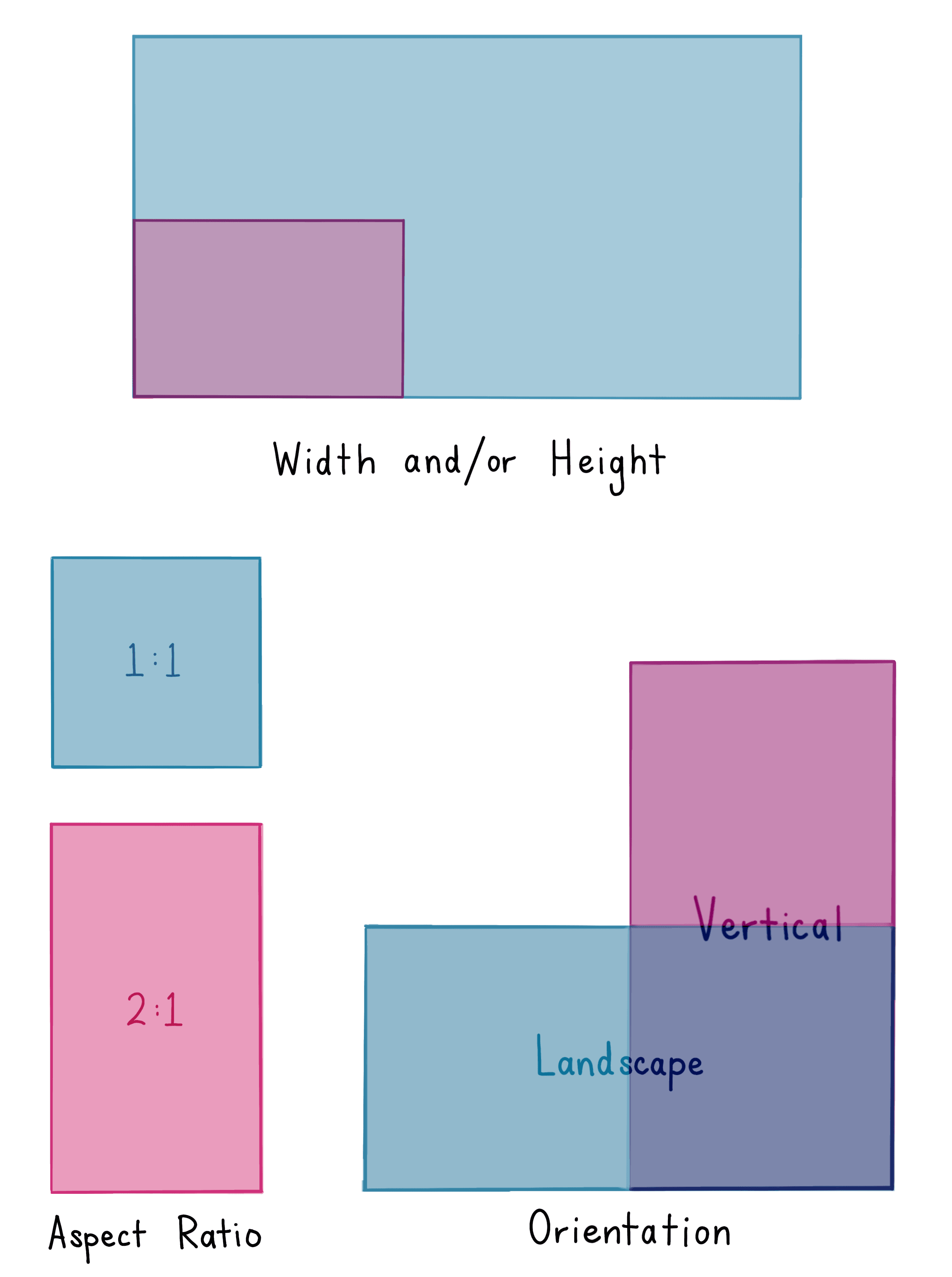
Breakpoint rules can be formed using a combination of minimum or maximums for width, height, aspect ratio, device resolution and device orientation.
If breakpoints are used to control layout behaviour, the interface will respond dynamically when the user resizes the window or turns their phone sideways.
By default, the provided breakpoints trigger based on window width, ranging from extra-small xs to extra large xl.
| xs | sm | md | lg | xl |
|---|---|---|---|---|
| < 576px | ≥ 576px | ≥ 768px | ≥ 992px | ≥ 1200px |
Additional breakpoints can be manually specified.
Atomic Layout
atomic-layout implements a grid-layout design pattern in a type-safe and functional manner. It provides a few primitive components which underpin the layout, allows customisation overrides and name-spaced areas.
Composition provides the layout foundation, combining individual child React components into a cohesive layout under the range of optional layout controls provided as properties.
By default, a Composition will create a 1-column layout,
<Composition > <ChartContainer > <LineChart dataSource ={sensorDataSource } /> <RealTimeDomain window ={5000} /> </ChartContainer > <Card >Components group goes here</Card > <SystemDiagram showComplexVariant /></Composition >If content being formatted isn't a React component, we use the Box component to wrap the content,
<Composition templateCols ="1fr 1fr" gap ={15}> <Box >Good news</Box > <Box >Bad news</Box > <Box >Fake news</Box > <Box >No news</Box ></Composition >When columns are being populated from the set of child components, the grid is populated in a left-to-right top down order.
The Composition accepts a wide range of properties which follow industry standard css-grid properties in a type-safe manner. These can be used to modify the layout logic, alignment and more!
Better markup with Areas
While building layouts by ordering content inside the Composition is manageable for simple layouts, its strongly recommended to abstract the arrangement of content from the actual markup.
We achieve this separation by describing where we want content to be placed, using areas. When multiple identical named area's have been defined, they are automatically grouped.
L-shaped areas are not possible, if such a shape is required (why?) we recommend using a series of nested compositions instead.
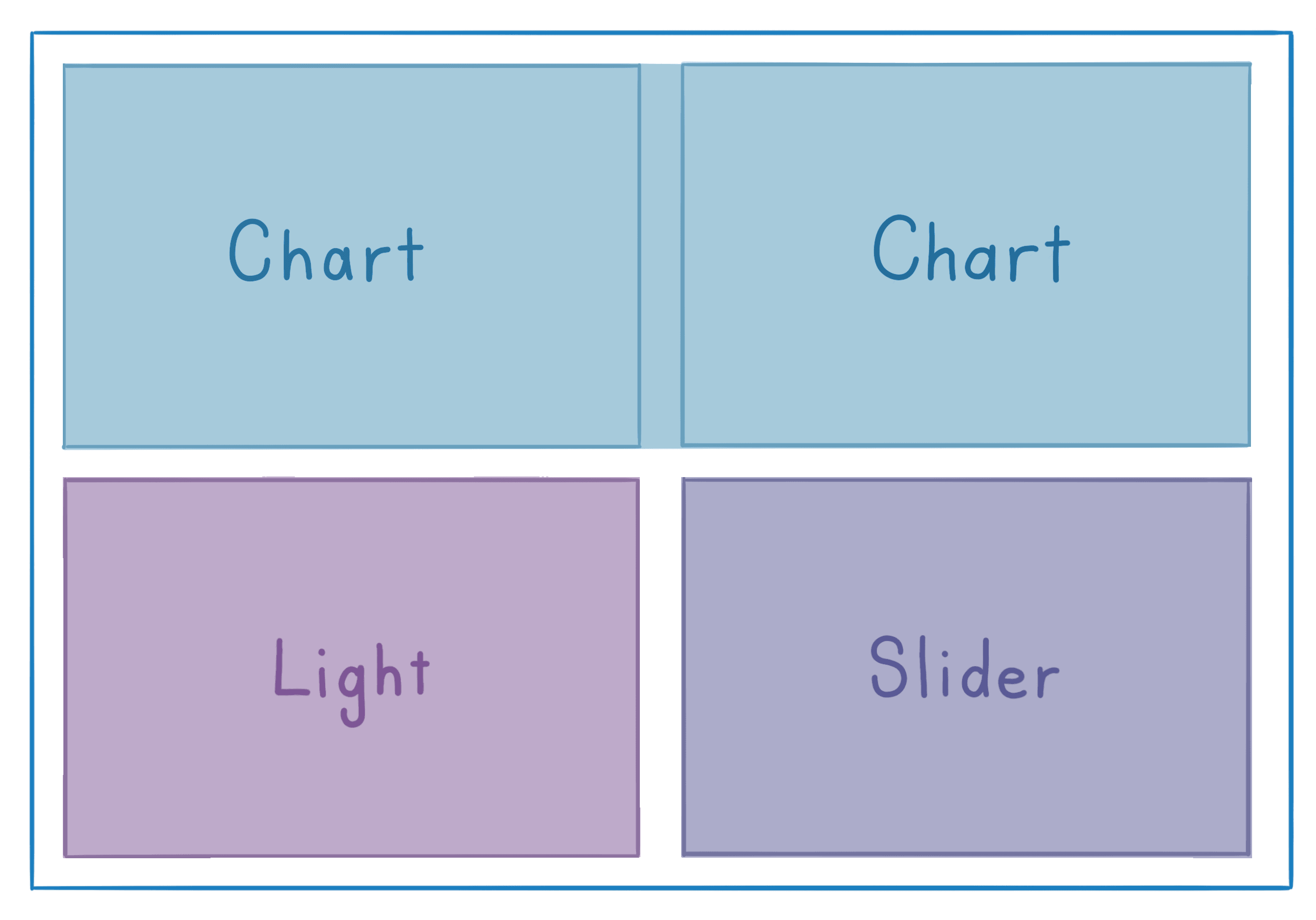
const pageLayout = ` Chart Chart Light Slider`export const SensorPage = (props : RouteComponentProps ) => { return ( <Composition areas ={pageLayout }> {Areas => ( <React .Fragment > <Areas .Chart > ... </Areas .Chart > <Areas .Light > ... </Areas .Light > <Areas .Slider > ... </Areas .Slider > </React .Fragment > )} </Composition > )}The pageLayout string describes rows and columns, and the area names are used in the Composition. By describing the arrangement explicitly, different area maps can be provided for different window sizes, and maintaining or reordering the layout is easier.
As the
{Areas => ( ... )}function syntax is used, we need to return a single object rather than many.It is recommend to use
React.Fragmentas shown but empty tags<> ... </>work too!
Responsive Properties
By combining the responsive behaviour of a breakpoint with the styling power of properties, its possible to define how a specific layout property will behave for a given range of viewports.
Responsive Properties can be used to slim down margins or gap sizing for compact layouts, enlarge content for large-screen use.
<Composition areas ={layoutDescription } gapMd ={30} gapXs ={10} marginMd ={20} marginXs ={5} >By default, the rules will apply from the specified breakpoint in a downward priority.
For example, specifying
gapLg={20} gapXs={10}means that the gap size is20pxfrom thelgbreakpoint until the window fits under thexsruleset.This behaviour can be inverted by providing
Layoutwith the desireddefaultBehaviourvalue.
Responsive Areas
Breakpoints allow you to fundamentally change the layout by switching to a more suitable Area declaration.
const smallLayoutDescription = ` Chart Slider Light`const normalLayoutDescription = ` Light Chart Light Slider`<Composition areasXs ={smallLayoutDescription } areasLg ={normalLayoutDescription } gap ={10}> {Areas => ( <React .Fragment > <Areas .Chart > ... </Areas .Chart > <Areas .Light > ... </Areas .Light > <Areas .Slider > ... </Areas .Slider > </React .Fragment > )}</Composition >Breakpoint driven visibility
It's also possible to hide components entirely. For example, inline usage instructions/diagrams could be replaced by a streamlined checklist on mobile displays.
Wrapping children components in an Only component will prevent them from rendering when their breakpoint conditions are met.
import { Only , Visible } from 'atomic-layout' <Only for ="lg">This text only draws on large screens</Only ><Only from ={{ minWidth : 500 }} to ={{ maxWidth : 900 }}> This text is visible within a custom range.</Only >In some applications, wrapping children in a Visible component might be preferred as it still renders the underlying component, but sets the visibility to 0. This would occur if the layout needs to remain consistent while the object is hidden.