Button
Buttons allow for click based interaction with devices.
Usage
To determine what to write to the device, Button's have a writer prop that takes a functional writer.
A writer that sets the bright variable to 255. The contents (children) between the <Button> </Button> tags render inside the button.
import { Button } from '@electricui/components-desktop-blueprint' <Button writer ={state => { state .bright = 255 }}> Set brightness to 255</Button >A writer that sets the rgb messageID to a red colour.
<Button writer ={state => { state .rgb = { r : 255, g : 10, b : 10, } }}> Set RGB to red</Button >A writer that sets the randfloat messageID to a random float between 0 and 1 each click.
<Button writer ={state => { state .randfloat = Math .random () }}> Send random number</Button >When calling a hardware callback function, use callback with the messageID instead of a writer.
<Button callback ="estop" > Disable All</Button >Add the noAck boolean prop (or set it to true), to disable automatic acknowledgement when a click has occured.
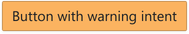
Intent Colours
The intent of the button allows you to change the colour.

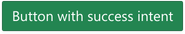

<Button intent ="success">Button with success intent</Button >Minimal Styling
Buttons can have minimal styling. Minimal buttons look like text with no frame or styling, on click they look like this:
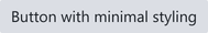
<Button minimal >Button with minimal styling</Button >Outline Styling
Buttons also support an outlined style.
<Button outlined >Button with outline styling</Button >Large and Small, Fills
Control the size of the buttons with the large and small properties.
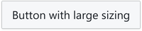
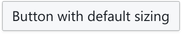
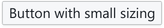
<Button large >Button with large sizing</Button ><Button >Button with default sizing</Button ><Button small >Button with small sizing</Button >A button will fill it's container with the fill property.

<Button >Default Button</Button ><Button fill >Button with Fill</Button >Grouping
Buttons can join to create command palletes or menu-like clusters. Buttons in groups accept the same set of properties applicable to standalone buttons.

import { ButtonGroup } from '@blueprintjs/core'import { Button } from '@electricui/components-desktop-blueprint'<ButtonGroup > <Button intent ="primary">Blue Pill</Button > <Button intent ="warning">Red Pill</Button ></ButtonGroup >Groups can draw vertically with the vertical prop.
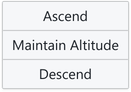
<ButtonGroup vertical > <Button >Ascend</Button > <Button >Maintain Altitude</Button > <Button >Descend</Button ></ButtonGroup >Icons
icon and rightIcon allow for an Icon to be integrated inside the Button.
Use either IconNames or the string name.