ColorPalette
ColorPalette provides fine or coarse interaction with RGB, HSV, or custom color data.
Usage
Color Picker is the base component, color channels are passed in, along with a writer.
This component and pipeline only support 8-bit color. This example assumes the hardware exposes individual messages r, g and b for the color channels. For structured data, normal accessor syntax applies.
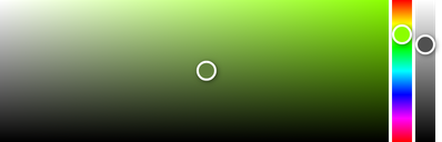
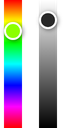
import { ColorPalette } from '@electricui/components-desktop' <ColorPalette red ="r" green ="g" blue ="b" writer ={(state , color ) => { state .r = color .r state .g = color .g state .b = color .b }}/>Under the hood, this component creates a CSS gradient, and provides logic/calculations for the handle positions.
Debouncing
Set the minimum duration between state pushes to hardware (in milliseconds) with throttleDuration. The duration counts down from the last user input event, and writes the value once the delay elapses.
<ColorPalette throttleDuration ={100} red ="r" green ="g" blue ="b" writer ={(state , color ) => { state .r = color .r state .g = color .g state .b = color .b }}/>OnRelease or Continuous Send
For many lighting systems it is desirable to immediately reflect user interaction in the hardware system.
By default, the ColorPalette will only commit the color values to the device once the handle has been released (mouse/touch up).
Manually specify the boolean sendOnlyOnRelease to set this behaviour.
<ColorPalette sendOnlyOnRelease ={false} red ="r" green ="g" blue ="b" writer ={(state , color ) => { state .r = color .r state .g = color .g state .b = color .b }} />Size
Manually specify sizing behaviour by passing a number to the width and/or height properties.
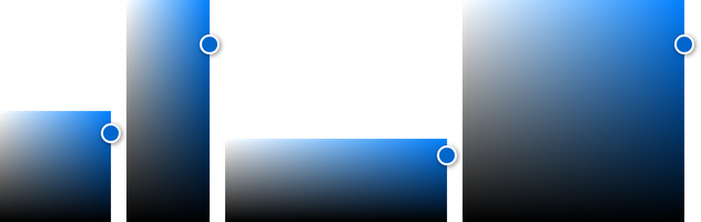
<ColorPalette width ={100} height ={100} red ="r" green ="g" blue ="b" writer ={(state , color ) => { state .r = color .r state .g = color .g state .b = color .b }}/>The component needs to be reloaded for
heightorwidthchanges to take effect.
Setting color by slider
Ready-made slider variants simplify hooking up hue, alpha and color controls.
These are separate components from the ColorPalette and can be put anywhere in the layout.

import { HueSlider } from '@electricui/components-desktop' <HueSlider red ="r" green ="g" blue ="b" writer ={(state , color ) => { state .r = color .r state .g = color .g state .b = color .b }}/>
import { AlphaSlider } from '@electricui/components-desktop' <AlphaSlider red ="r" green ="g" blue ="b" alpha ="a" writer ={(state , color ) => { state .r = color .r state .g = color .g state .b = color .b state .a = color .a }}/>These slider components should not be parented by a
ColorPalette, they are standalone components.
Orientation
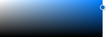
The vertical property controls the orientation of the HueSlider and AlphaSlider components.
<HueSlider vertical red ="r" green ="g" blue ="b" writer ={(state , color ) => { state .r = color .r state .g = color .g state .b = color .b }}/><AlphaSlider vertical red ="r" green ="g" blue ="b" alpha ="a" writer ={(state , color ) => { state .r = color .r state .g = color .g state .b = color .b state .a = color .a }}/>Size
Both the HueSlider and AlphaSlider components support properties for width and height.

<HueSlider width ={100} red ="r" green ="g" blue ="b" writer ={(state , color ) => { state .r = color .r state .g = color .g state .b = color .b }}/> <AlphaSlider width ={200} red ="r" green ="g" blue ="b" alpha ="a" writer ={(state , color ) => { state .r = color .r state .g = color .g state .b = color .b state .a = color .a }}/>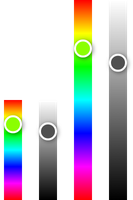
<HueSlider height ={100} vertical red ="r" green ="g" blue ="b" writer ={(state , color ) => { state .r = color .r state .g = color .g state .b = color .b }}/> <AlphaSlider height ={200} vertical red ="r" green ="g" blue ="b" alpha ="a" writer ={(state , color ) => { state .r = color .r state .g = color .g state .b = color .b state .a = color .a }}/>Both
heightandwidthprops apply to normal andverticalsliders