Composition
Compositions contain and format the components which make up the layout.
Usage
Use Composition to control the layout. Box is a container primitive which responds to alignment and spacing rules.
Without any specified properties, a composition will create a auto-sized 1-column layout for it's children.
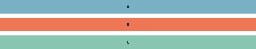
import { Composition , Box } from 'atomic-layout' <Composition > <Box >A</Box > <Box >B</Box > <Box >C</Box ></Composition >Properties help control the wide surface of aesthetic controls offered by Composition. This example creates a 2-column layout with equal column widths, with no other styling.
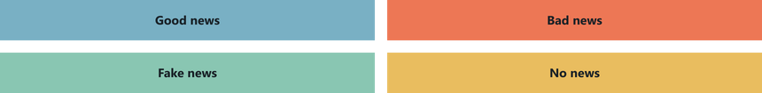
<Composition templateCols ="1fr 1fr" gap ={15}> <Box >Good news</Box > <Box >Bad news</Box > <Box >Fake news</Box > <Box >No news</Box ></Composition >Composition children can be any valid React component, not just Box.
<Composition > <ChartContainer > <LineChart dataSource ={sensorDS } /> <RealTimeDomain window ={5000} /> </ChartContainer > <Card >Components group goes here</Card > <SystemDiagram showComplexVariant /></Composition >Layout Formatting
A range of layout properties control the aesthetic behaviour of the Composition and affect it's children. These act as syntactic sugar for industry standard css-grid properties.
Most properties accept either a Number, or a rich String typically containing multiple values or units.
This example sets the size of all columns to 1 fractional unit, with a gap between the children of the composition.
<Composition autoCols ="1fr" gap ={10}> ...</Composition >| Property | Description |
|---|---|
gap | Sets both the gapCol and gapRow values to control spacing between child components |
gapCol | Controls horizontal spacing between Composition children |
gapRow | Controls vertical spacing between Composition children |
templateRows | Defines the height of a specific number of rows |
templateCols | Defines the width of a specific number of columns |
autoRows | Defines the height of implicitly created rows |
autoCols | Defines the width of implicitly created columns |
autoFlow | Controls how the children arrange on the grid |
Its possible to use properties on Box to override templated layout properties. The following example overrides the content placement in a 3-column layout.
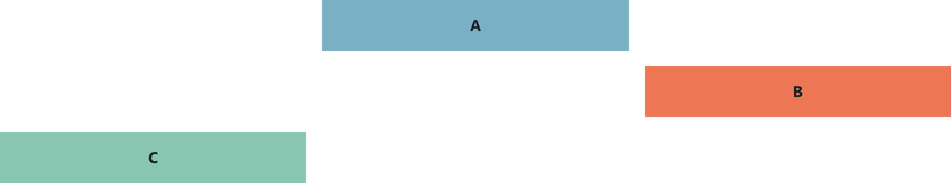
<Composition templateCols ="1fr 1fr 1fr"> <Box row ={1} col ={2}> A </Box > <Box row ={2} col ={3}> B </Box > <Box row ={3} col ={1}> C </Box ></Composition >See the Box component docs for more properties.
Areas
Declarative layouts are the recommended way to decouple presentation markup from component logic. This also allows layout variations for unusual screen sizes.
Create the layout markup by passing a '2D description' of the page to Composition with the areas property.
Inside the composition, each area is presented as a pure React component. Duplicated strings are treated as one contiguous area.
const pageLayout = ` Status Status Button Slider` export const SensorPage = (props : RouteComponentProps ) => { return ( <Composition areas ={pageLayout }> {Areas => ( <React .Fragment > <Areas .Status > ... </Areas .Status > <Areas .Button > ... </Areas .Button > <Areas .Slider > ... </Areas .Slider > </React .Fragment > )} </Composition > )}User specified areas should be declared with Capitalised first character.
If the area description has lower-case areas such as "slider", the components provided in the layout will mutate into the legal style "Slider".
Alternative areas
To provide a different layout configuration for different screen-sizes, define extra descriptions with the same area names, and use the responsive areas properties on the parent Composition.
const thinLayout = `SliderChartLight` const wideLayout = `Chart ChartLight Slider` export const SensorPage = (props : RouteComponentProps ) => { return ( <Composition areas ={thinLayout } areasLg ={wideLayout }> {Areas => ( <React .Fragment > <Areas .Chart > ... </Areas .Chart > <Areas .Light > ... </Areas .Light > <Areas .Slider > ... </Areas .Slider > </React .Fragment > )} </Composition > )}If this doesn't make sense, we suggest reading about Responsive Properties in the layouts tutorial.
Breakpoints
Breakpoint names differentiate window width.
| xs (default) | sm | md | lg | xl |
|---|---|---|---|---|
| <576px | ≥576px | ≥768px | ≥992px | ≥1200px |
Breakpoints can also be manually specified.