Legend
A Legend displays color coded UI elements matching charted signals, helping handle user-interactions like highlighting or visibility toggles.
Usage
The Legend component is used alongside the useLegend hook.
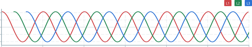
Legend renders as a Blueprint Tag and can behave as a Button for user-interaction. When multiple entries are used, hovering over a Legend element will dim other charts to help highlight the user's selection.
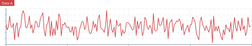
In this minimal example, a single LineChart is rendered with connections to the Legend data. Clicking on the Legend tag will toggle visibility of the LineChart.
Remember: The
Legendcomponent is used outside of theChartContainerto allow the most control over positioning behaviour.
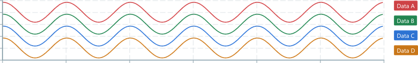
import { Legend } from '@electricui/components-desktop-blueprint-timeseries'import { ChartContainer , LineChart , RealTimeDomain , useLegend } from '@electricui/components-desktop-charts'import { useMessageDataSource } from '@electricui/core-timeseries'import { Colors } from '@blueprintjs/core' const OverviewPage = () => { const dataSourceA = useMessageDataSource ('adc') const legendData = useLegend ({ dataA : { name : 'Data A', color : Colors .RED3 , } }) return( <div > <Legend data ={legendData } /> <ChartContainer > <LineChart dataSource ={dataSourceA } color ={legendData .dataA .color } opacitySource ={legendData .dataA .opacity } visibilitySource ={legendData .dataA .visible } /> <RealTimeDomain window ={10000} /> </ChartContainer > </div > ) }The component will automatically tile entries horizontally based on the contents provided via the data prop.
noHover
Add the noHover prop, or set it to false to disable hover highlighting.
<Legend data ={legendData } noHover />noToggle
Add the noToggle prop to disable the Button functionality which allows toggling the controlled Chart element's visibility.
<Legend data ={legendData } noToggle />Justification
Provide the justifyContent prop with a valid CSSProperties matching justifyContent to control horizontal positioning.
Typical options include: start, center, end, left, right, space-around.
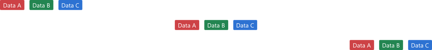
<Legend data ={legendData } justifyContent ="start" /><Legend data ={legendData } justifyContent ="center" /><Legend data ={legendData } justifyContent ="end" />Orientation
The boolean vertical prop can be added to change the layout strategy to vertical tiling.
<Legend data ={legendData } vertical />