Inline Help Popover
Often user-interfaces provide configuration controls which require prior experience or deep understanding of the product. In these situations, user-friendly help tool-tips can provide additional context, guides, or documentation links.

Component
Create a simple wrapper component that renders as a Help Icon, and displays content on hover using a Popover components.
Put this in your application's src/application/components folder as HelpPopover/index.tsx or similar.
import React from 'react'import { IconNames } from '@blueprintjs/icons'import { Icon, Popover, Intent, PopoverPosition} from '@blueprintjs/core'type HelpProps = { title: string children: any}export const HelpPopover = (props: HelpProps) => { return ( <React.Fragment> <Popover interactionKind="hover" hoverOpenDelay={200} content={ <div style={{ padding: '1em' }}> <h3>{props.title}</h3> <p>{props.children}</p> </div> } > <Icon icon={IconNames.HELP} intent={Intent.WARNING} iconSize={20} /> </Popover> </React.Fragment> )}Usage
In the front-end layout, include the custom component, then use it by passing the popover's layout as the components child.
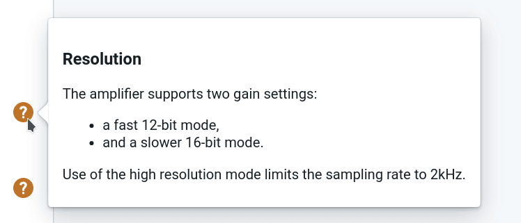
<HelpPopover title="Resolution"> The amplifier supports two gain settings: <ul> <li>a fast 12-bit mode,</li> <li>and a slower 16-bit mode.</li> </ul> Use of the high resolution mode limits the sampling rate to 2kHz.</HelpPopover>Any layout can provided, but we'd recommend following a consistent and minimal approach.
If more customisation is needed, consider creating an additional component which controls the contents rendered in the HelpPopover, or create a new component with inbuilt properties and logic to need your layout requirements.