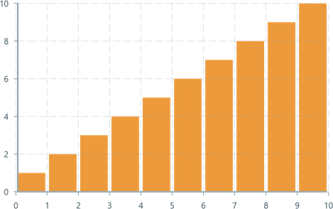
BarChart
BarCharts visually compare quantities, and will update interactively as new data arrives.
Charts rely on a DataSource to provide their data, most commonly this will be of the type MessageDataSource. We recommend reading the DataSource documentation first.
Usage
One common use of a BarChart is to represent sensor data in buckets, such as specific wavelengths from a spectrometer, or frequencies in a signal after FFT post-processing.
To use a BarChart:
ChartContaineris required to provide a parent context,MessageDataSourceis required to catch and format the relevant inbound messages,- A
BarChartDomainrenders the chart when new data comes in.
import { ChartContainer , BarChart , BarChartDomain ,} from '@electricui/components-desktop-charts'import { useMessageDataSource } from '@electricui/core-timeseries' const spectralDataSource = useMessageDataSource <number[]>('multispec')<ChartContainer > <BarChart dataSource ={spectralDataSource } columns ={14} /> <BarChartDomain /></ChartContainer >The format of the
Eventstream emitted by theDataSourceis important.
BarChartexpects an array of numeric values and plots starting with the first element and ending with either the last element or the value of thecolumnsproperty, whichever comes first.
Axis Annotations
Axis frames help provide context to plotted data. Read the ChartAxis documentation for more detail and configuration.
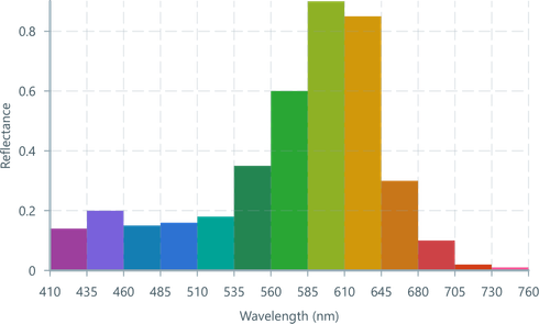
At current time, BarChart assumes that the tick-values match the indexing of data provided by the Datasource.
As this spectral data is hardware formatted into buckets starting at index 0, the axis formatter draws the correct wavelengths.
<ChartContainer > <BarChart dataSource ={spectralDataSource } columns ={13}/> <BarChartDomain /> <VerticalAxis label ="Absorbance" /> <HorizontalAxis label ="Wavelength (nm)" tickValues ={[0, 1, 2, 3, 4, 5, 6, 7, 8, 9, 10, 11, 12]} tickFormat ={i => `${i * 25 + 300}`} /></ChartContainer >Histograms from Timeseries signals
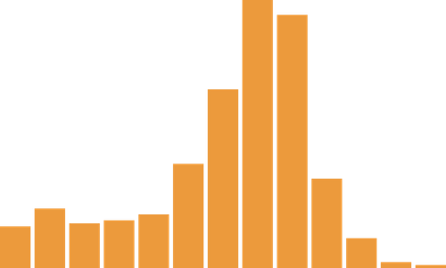
To generate a histogram of timeseries sensor data, import the histogram function. This sits between the typical datasource and the BarChart.
import { histogram } from '@electricui/dataflow'import { DataSource } from '@electricui/core-timeseries' const dataSource = new DataSource (`force`)const histo = histogram (dataSource , 0, 255, 10)<BarChart columns ={10} dataSource ={histo }/>Formatting
Columns
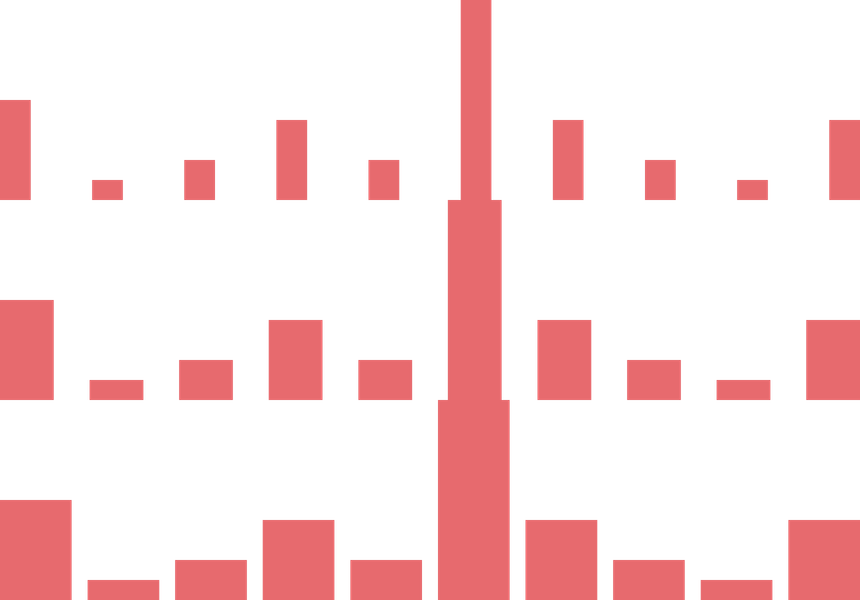
The columns property accepts a positive number of buckets/columns to display.

<BarChart dataSource ={dataSource } columns ={4}/><BarChart dataSource ={dataSource } columns ={10}/><BarChart dataSource ={dataSource } columns ={200}/>Bar Color
The color prop can be a string or number.
Passing hex color="#0066cc locally is fine, but we recommend using centralised colors to maintain consistency.
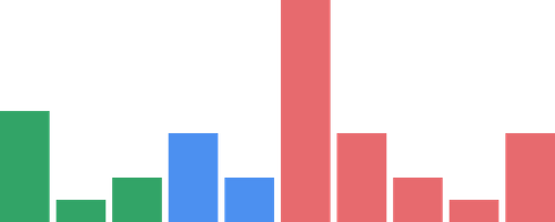
import { Colors } from '@blueprintjs/core'<BarChart dataSource ={dataSource } columns ={10} color ={Colors .GREEN5 }/><BarChart dataSource ={dataSource } columns ={10} color ="#0066cc"/>Passing an array will allow for per-bar color control.
const barColors = [Colors .BLUE3 , Colors .GREEN3 , Colors .RED3 , Colors .GRAY2 ]<BarChart dataSource ={dataSource } columns ={10} color ={barColors }/>Like LineChart a series of accessor's allow for DataFlow or Signal based dynamic controls.
colorAccessor allows for per-column dynamic colour control using data available inside the dataSource. This function must return an array of colours, one for each column.
opacity sets the opacity between 0 and 1. opacityAccessor and opacitySource allow for dynamic control.
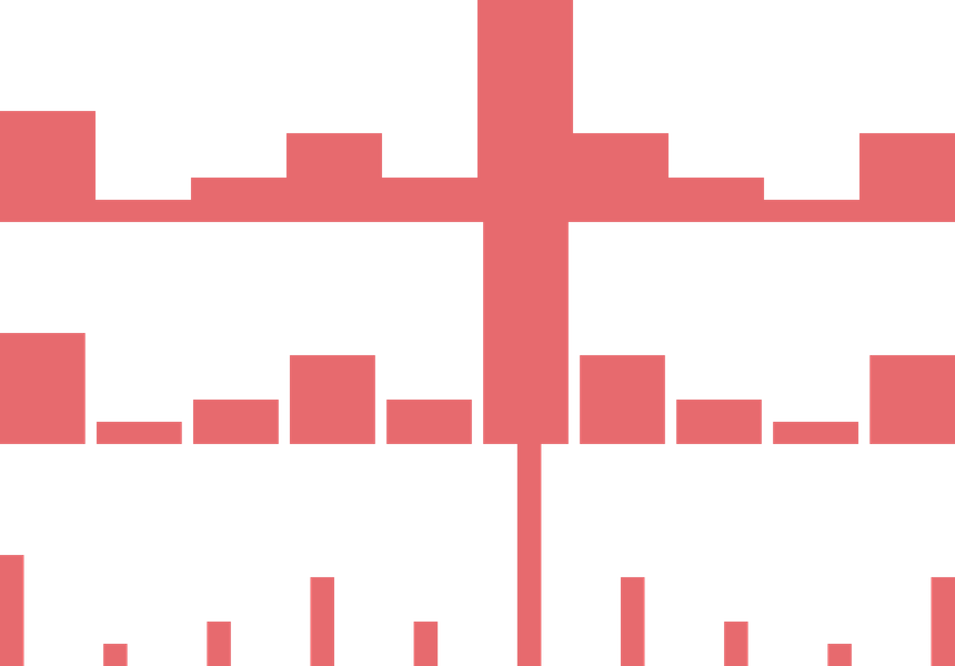
Bar Width
The barWidth property accepts a positive number to customise the rendered width of each bar.
<BarChart dataSource ={dataSource } columns ={10} barWidth ={2}/><BarChart dataSource ={dataSource } columns ={10} barWidth ={4}/><BarChart dataSource ={dataSource } columns ={10} barWidth ={10}/>Bar Gap
The barGap property accepts a positive number to control whitespace rendered between each bar.
The default gap is 1.
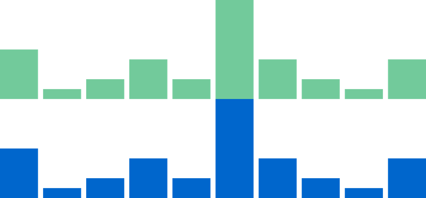
<BarChart dataSource ={dataSource } columns ={10} barGap ={0}/><BarChart dataSource ={dataSource } columns ={10} barGap ={1}/><BarChart dataSource ={dataSource } columns ={10} barGap ={10}/>Overdraw
Like all other components in ChartContainer, the render order of componentsx executes first-to-last.
While this is uncommon for normal LineChart use, BarChart are typically thicker boxes and will occlude layers rendered earlier.
<ChartContainer > <BarChart dataSource ={data } columns ={10} color ={Colors .RED4 } /> <BarChart dataSource ={data } columns ={5} color ={Colors .BLUE4 } /> <BarChart dataSource ={data } columns ={3} color ={Colors .GREEN4 } /></ChartContainer >This can be abused with a second datasource containing an area of importance for selective highlight behaviour.
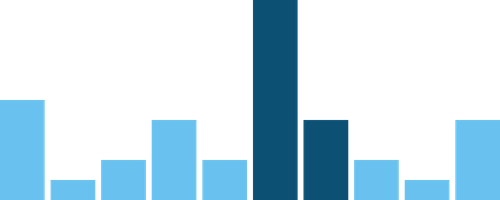
<ChartContainer > <BarChart dataSource ={data } columns ={10} color ={Colors .COBALT5 } /> <BarChart dataSource ={highlightData } columns ={10} color ={Colors .COBALT1 } /></ChartContainer >