Dropdown
Dropdowns provide compact selection of pre-set state configurations.
Usage
The parent Dropdown properties specifies the controlled variable, and the 'collapsed' placeholder text for the button.
Child Dropdown.Option elements provide control over the expanded options list. Each Option specifies it's selection value, along with formatting controls for a string and icon.
The underlying behaviour is identical to a RadioGroup.
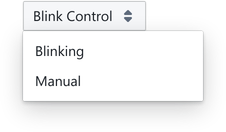
import { Dropdown } from '@electricui/components-desktop-blueprint' <Dropdown accessor ="led_blink" placeholder ={() => 'Blink Control'}> <Dropdown .Option value ={1} text ="Blinking" /> <Dropdown .Option value ={0} text ="Manual" /></Dropdown >The order of the child Dropdown.Option components sets the ordering in the rendered dropdown.
For structured data, normal accessor syntax applies.
<Dropdown accessor ="led_blink" placeholder ={() => 'Blink Control'} writer ={(state , value ) => { state .led_blink = value }}> <Dropdown .Option value ={1} text ="Blinking" /> <Dropdown .Option value ={0} text ="Manual" /></Dropdown >In situations such as mode selection, it's acceptable to read the mode status from one ID, and write the selection 'request' to a different one.
Formatting Placeholder
The placeholder text displayed on the collapsed dropdown element can be heavily styled by providing the placeholder property.
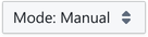
This shows the selected mode while collapsed, or provides a call to action to switch modes.
The placeholder string renders until the user selects an option, after which the Dropdown.Option text overrides it.


<Dropdown accessor ="led_blink" placeholder ={selectedOption => selectedOption ? `Mode: ${selectedOption .text }` : 'Select Mode' }> <Dropdown .Option value ={1} text ="Blink" /> <Dropdown .Option value ={0} text ="Manual" /></Dropdown >Optionally, customise the placeholder behaviour by providing a function which accepts the selected object properties, and return a string.
<Dropdown accessor ="led_blink" placeholder ={selectedOption => selectedOption ? `Mode: ${selectedOption .text }` : 'Select Mode' }> <Dropdown .Option value ={1} text ="Blink" /> <Dropdown .Option value ={0} text ="Manual" /></Dropdown >To display a constant string regardless of the selected option, the placeholder can return a constant string.
<Dropdown accessor ="call_action" placeholder ={() => 'Action Options'}> <Dropdown .Option value ={1} text ="Blink Five Times" /> <Dropdown .Option value ={0} text ="Blink Ten Times" /></Dropdown >Formatting Options
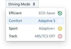
Style the selectable options by providing the label property with text, or passing a React component to the labelElement property.
The element renders to the right of the option.
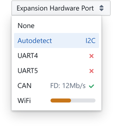
// No Label<Dropdown.Option value={0} text="None" />// Descriptive Label<Dropdown.Option value={1} text="Autodetect" label="I2C" />// Icon<Dropdown.Option value={2} text="UART4" labelElement={<Icon icon="small-cross" color={Colors.RED4} />}/>// Print eUI strings<Dropdown.Option value={4} text="CAN" labelElement={ <> <Printer accessor="can_m" />: <Printer accessor="can_r" /> Mb/s <Icon icon="small-tick" color={Colors.GREEN4} /> </> }/>// Any legal UI components will also work<Dropdown.Option value={5} text="WiFi" labelElement={ <div style={{ width: '140px', maxWidth: '90px', marginLeft: 'auto', paddingTop: '0.4em', }} > <ProgressBar accessor="progress" intent="warning" /> </div> }/>Positions
The popoverProps property on the Dropdown parent allows for repositioning of the expanded content.
Under the hood, dropdowns use Popover, which means minimal specifies if a handle renders, and the position is also developer controllable.
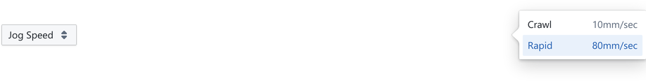
<Dropdown accessor ="speed" placeholder ={() => 'Jog Speed'} popoverProps ={{ position : 'right', minimal : false }}> <Dropdown .Option value ={10} text ="Crawl" /> <Dropdown .Option value ={80} text ="Jog" /></Dropdown >The position property accepts string "right" or enum Position.RIGHT arguments as described in the Popover Position Control documentation.