UI Development
Now we have the toolchain installed and a microcontroller running some example code, lets setup and start customising the template in a sandbox environment and control our hardware!
Starting with a template
From the command-line, run: arc init hello-electric to populate the template in a new folder called hello-electric.
You can use arc init to use the working directory if it's empty.
This will bootstrap a new project, follow the prompts to enter the product name.
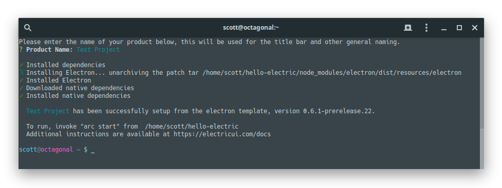
Product Nameis the human readable name used in the application title-bar, installers/uninstallers, OS applications lists, and in package metadata.Examples:
Fancy Datalogger,Killer Robot UI,Harmonica Test-Jig Controller
This process will download all dependencies required and set everything up.
Launching the development sandbox
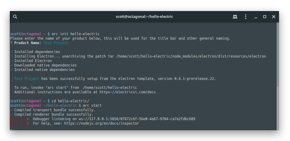
To run the program, jump into the top level project directory and run arc start to boot the development interface.
You should see the main application window open and show a connection screen, with either a split-window, or separate debugger window.
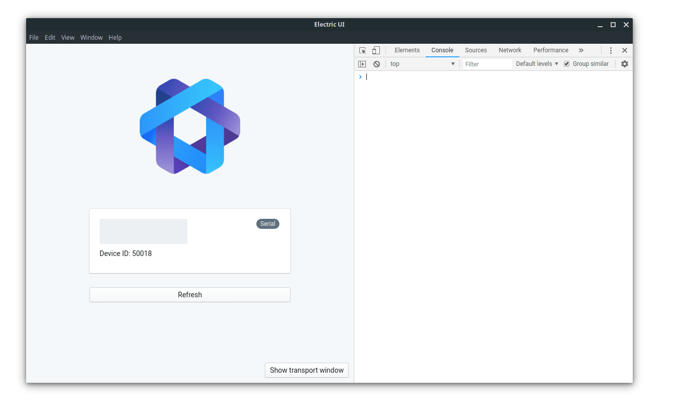
When the development environment started, a secondary section or window will have also spawned, presenting the debugger for the render thread. This debugger is useful for UI troubleshooting and performance analysis.
We strongly recommend splitting it into a separate window and changing the debugger view to the Console tab.
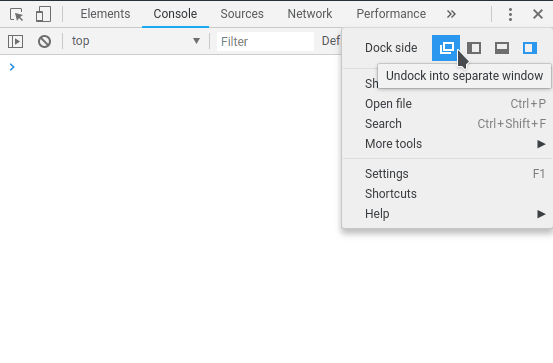
You can also toggle the debugger through the title-bar menu DevTools > Toggle Developer Tools.
Editing the template
Open the arc generated project folder hello-electric with your IDE/text editor of preference. We strongly recommend VS Code, as the real-time Typescript hinting integration works wonderfully.
The main application sources are in /src/application/pages/DevicePages, with OverviewPage.tsx being the first main view. Open it in your editor and you'll see the layout of the page.
Typescript files start with imports at the top, followed by the component definition OverviewPage which contains the UI layout.
// Component imports belong at the topimport React from 'react'// ...import { Printer } from '@electricui/components-desktop' // OverviewPage is an exported React function which renders a layoutexport const OverviewPage = () => { // Hook usage goes here return ( // UI Layout goes here <React .Fragment > Internal battery level: <Printer accessor ="batt" /> </React .Fragment > )}The hello-blink demo firmware exposes LED blinking parameters, allowing you to vary the frequency, enable/disable blinking, and manually override the LED state. We'll build out the UI and firmware to provide better control over the hardware.
Displaying data as text
The template already has some simple components to visualise the hello-blink example. We'll be adding more components to the UI to get started.
We want to print the led_state variable as text, so we'll use a Printercomponent and some human readable text. Electric UI components use an accessor property to provide the data source.
import { Printer } from '@electricui/components-desktop'We'll import it at the top of our file, then use the <Printer /> component in our layout.
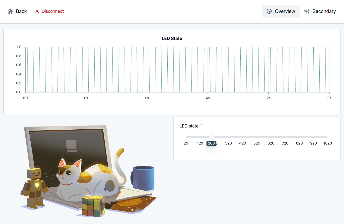
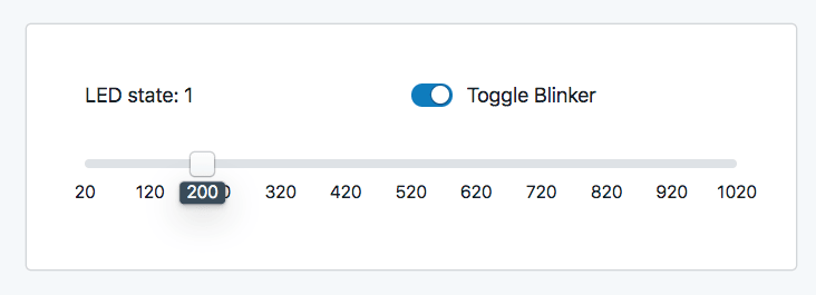
LED state: <Printer accessor ="led_state" />The printer can go anywhere inside the <React.Fragment> ... </React.Fragment> block, but we suggest above the slider (inside the <Card> block).
Save the source file, the UI will update and you should see the text changing as the light on your hardware blinks.
If you play with the slider, you'll notice that the led_state doesn't always keep up with the hardware LED state, and for rapid blinking, the graph shows the wrong shape. You might have heard of Nyquist Theorem before, and the slow polled variable requests made by the template are responsible.
Polling hardware for data
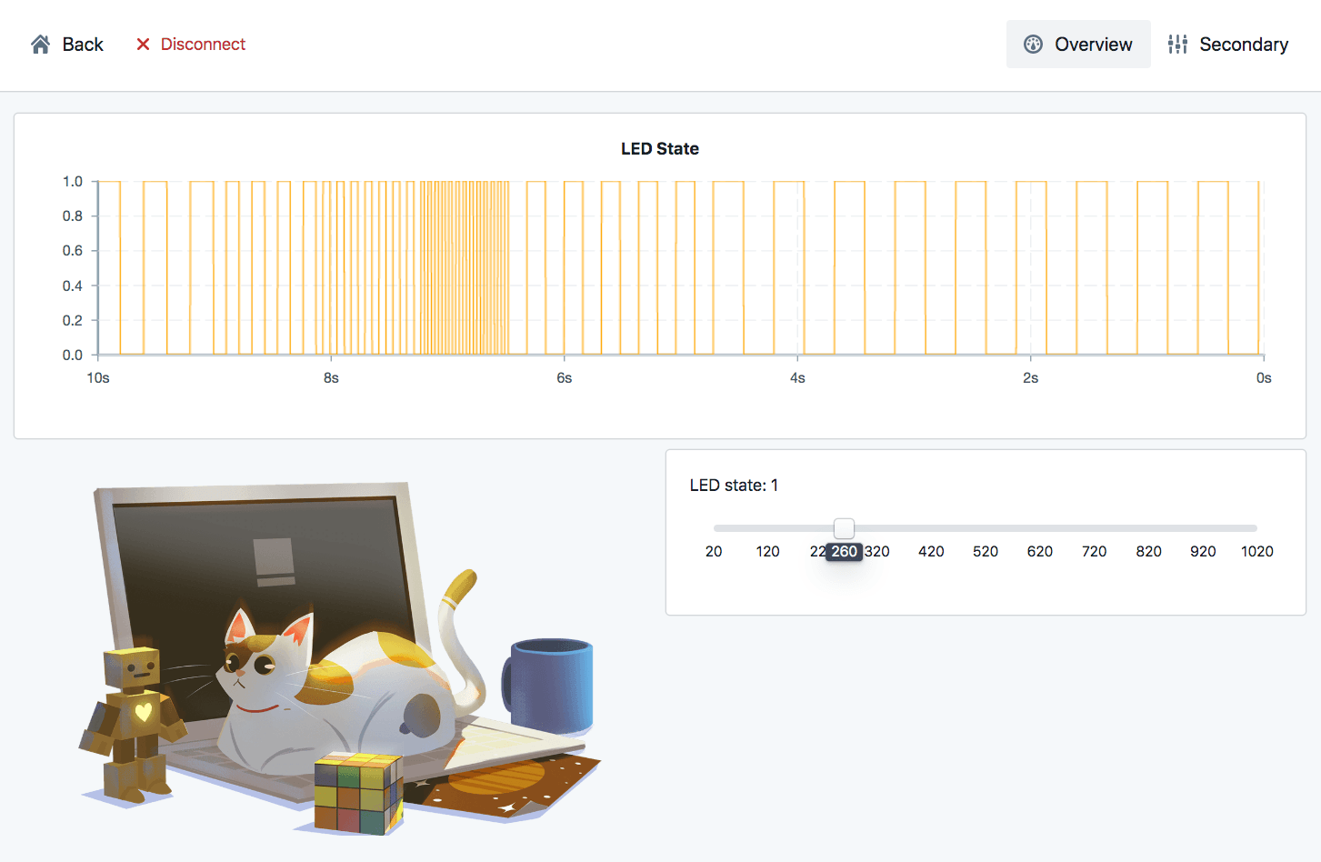
The template includes a IntervalRequester near the top of the body which requests variables every 250 milliseconds.
<IntervalRequester messageIDs ={['led_state', 'led_blink', 'lit_time']} interval ={250}/>Change the interval to 50ms, save, and see at how this changes the graphed data.
While its tempting to continue 'increasing the polling frequency', its not the best way to capture rapid changes in state. Likewise, it's inefficient to waste bandwidth polling settings or sensor data more often than the underlying data changes.
Pushing UI updates from hardware
Instead of polling the microcontroller periodically for variable states, we will change the embedded firmware to send updated led_state data as the changes occur.
Open up your microcontroller's editor to make a small tweak to the demo firmware flashed earlier.
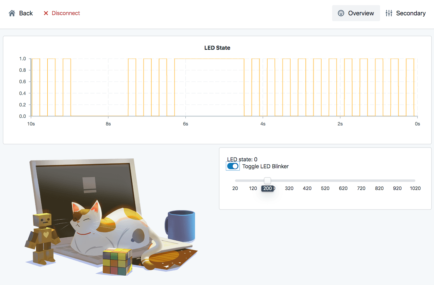
Add a eui_send_tracked( "led_state" ); function call to the blink logic, reflash your hardware, and play with the UI.
if( millis() - led_timer >= glow_time ){ led_state = !led_state; //invert led state led_timer = millis(); eui_send_tracked( "led_state" ); // send the new value to the UI}The UI is now updating as soon as the LED changes state, and the graph should properly represent the blinking LED's behaviour.
Blink mode control
Lets add a two-state switch to toggle the blinking behaviour on and off. We're going to use a Switch component.
We've already imported the Slider component from that package, so just add the Switch import to the same import.
import { Slider , Switch } from '@electricui/components-desktop-blueprint'Then, just below our Printer, lets add the switch.
<Switch unchecked ={0} checked ={1} accessor ={state => state .led_blink } writer ={(state , value ) => { state .led_blink = value }}> Toggle LED Blinker</Switch >It accepts the unchecked and checked properties which let you specify the intended state of the variable.
For the switch to show the correct position as the hardware changes state, we use the accessor property to specify the input state.
When you click on the switch to toggle the setting, you are writing a new value against the current state. This is done using the writer property, where we update the led_blink state with the value given to us by the component.
Toggling the switch will stop the blinking, but the LED will stick in an ON or OFF state when the mode changes.
Try adding another Switch, or a Checkbox component to manually set the led_state variable to 0 or 1 while led_blink is disabled.
Cleaning up the layout
Some new components have been added, but any reasonable UI will need the ability to group and position components to control their UI layout.
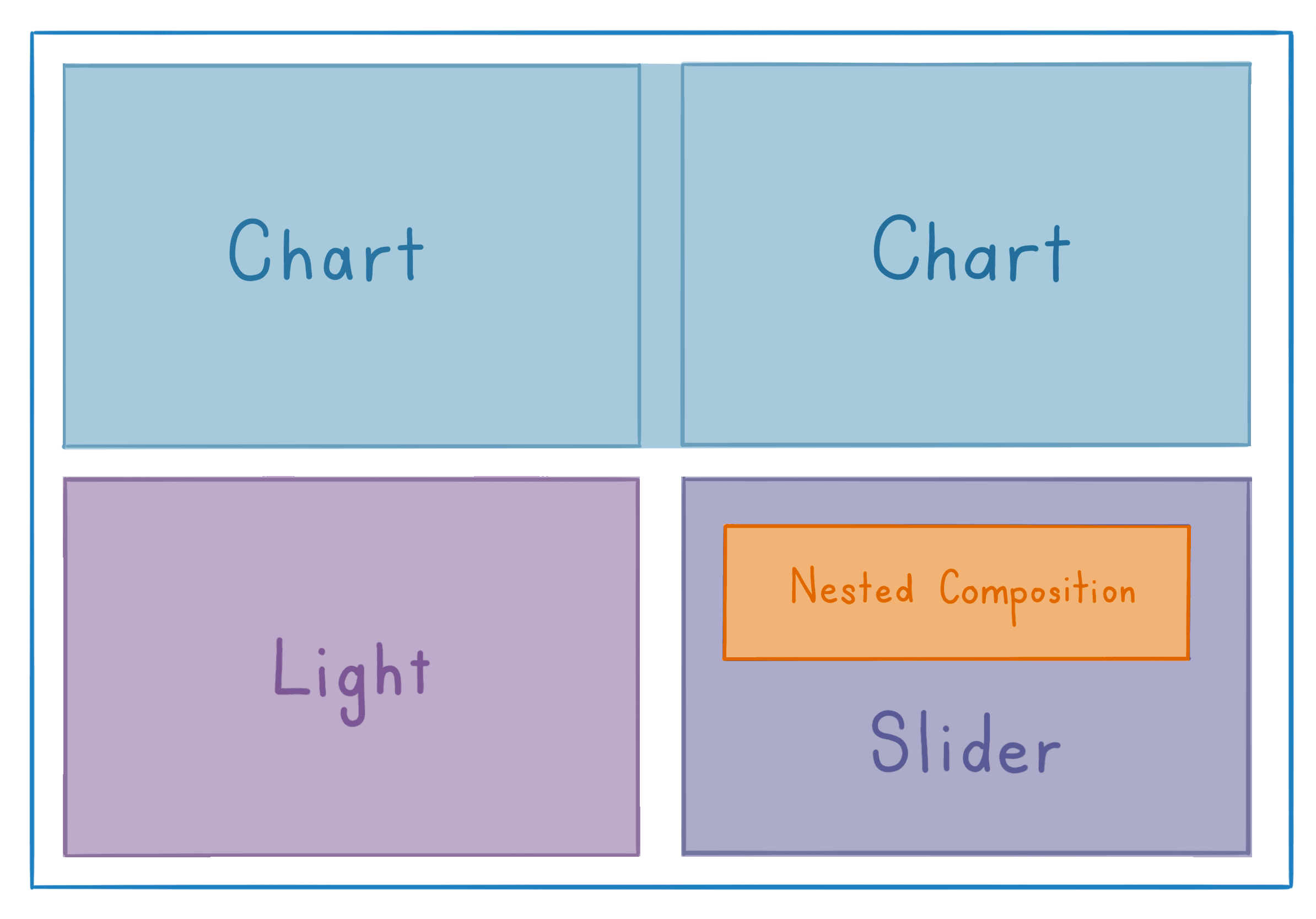
Compositions form the skeleton of the UI, providing rules which format the UI components. The template uses the areas feature to define the arrangement of zones which are used during layout.
const layoutDescription = ` Chart Chart Light Slider`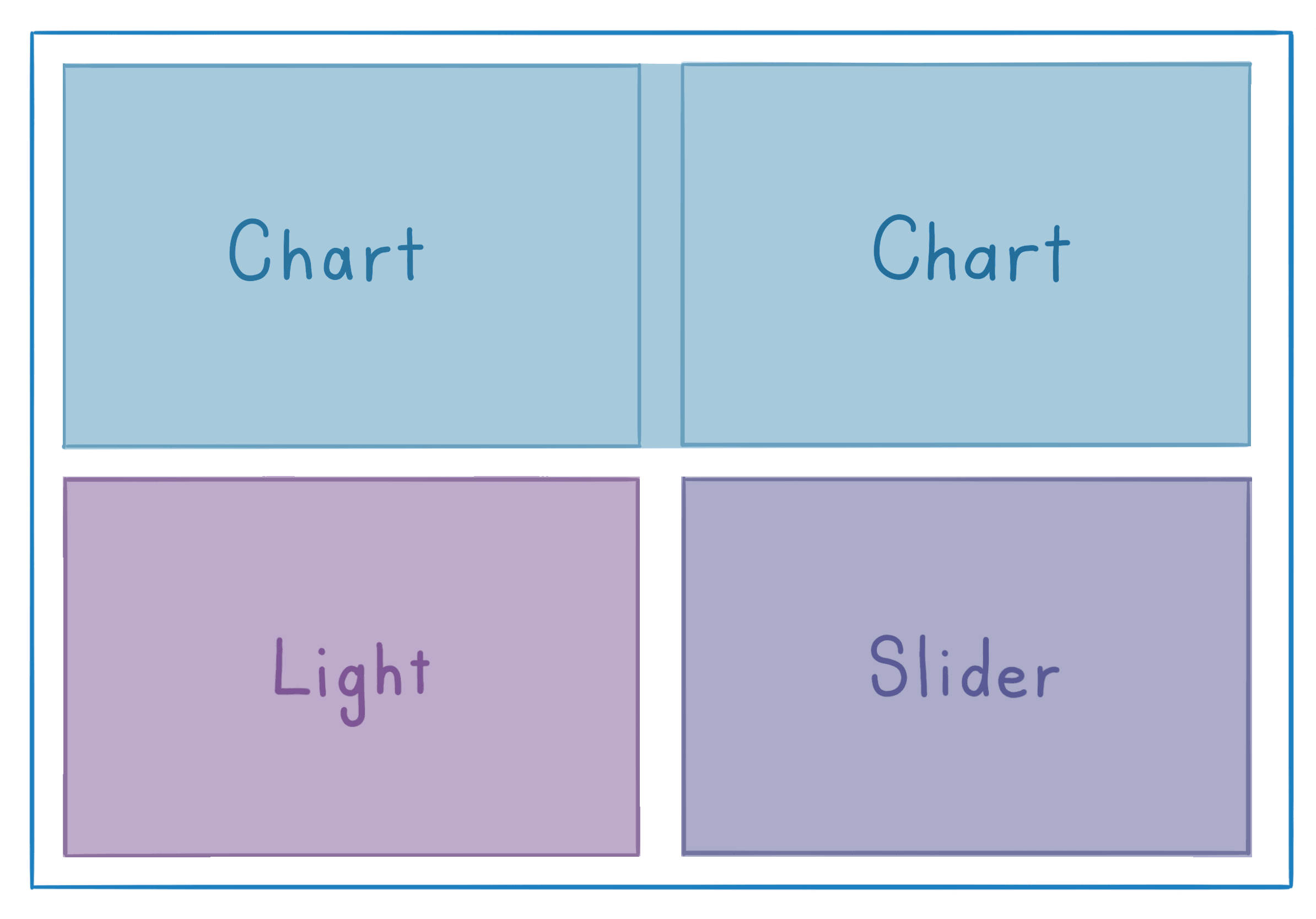
Because the Chart area was referenced twice, the layout engine treats them as one larger area. This templated layout is used in the composition by passing in the description to the areas property:
<Composition areas ={layoutDescription } gap ={10} autoCols ="1fr"> {Areas => ( <React .Fragment > <Areas .Chart > ... </Areas .Chart > <Areas .Light > ... </Areas .Light > <Areas .Slider > ... </Areas .Slider > </React .Fragment > )}</Composition >We're going to put another Composition inside the <Areas.Slider> area to arrange the Printer and Switch components like so:
<Composition templateCols ="1fr 1fr" margin ={10}> <Box > LED state: <Printer accessor ="led_state" /> </Box > <Box > <Switch unchecked ={0} checked ={1} accessor ={state => state .led_blink } writer ={(state , value ) => { state .led_blink = value }} > Toggle Blinker </Switch > </Box ></Composition >The templateCols="1fr 1fr" property tells Composition that we want the layout to use two evenly sized columns. We add some spacing from our parent Card by setting the margin.
After saving, the components will position themselves horizontally.
Try vertically centering the layout by adding a justifyItems="center" property to the Composition. The layouts article teaches the power of composition driven layouts in more detail.
Moving on
With the basics worked out, you can start making a UI for your own project!
We strongly recommend reading the debugging, layout and custom data structures guides as a primer on the most important areas during development.
Theelectricui-embedded/examples/demonstrations folder has a set of self contained demos which expose simulated data for examples like water heaters, garage doors or test equipment. Try building a simple UI against simulated data, or dive into your own project!